Finalists
1st Prize - 2nd Prize - 3rd Prize - Honourable Mentions - Special Mentions - Finalist - Top50OGURECTUR271996 - HECSOPGER222947 - HUYNGOVIE011206 - PALDAVCOL224724 - PAPANTITA120508 - PETMELGER261999 - SIEJULPOL271202 - KIMJINSOU300621 - YANPATTHA274080 - MAUDEMITA211998 - ABERYOJAP082222 - CASSANSPA182022 - EMAAHMEGY084493 - SARRAJBEN080314 - VAEMOHIRA231792 - DAUMUHIND140222 - BULAYSTUR211717 - LIUBOCHI217685 - MAGOLAEGY235518 - WUJIACHI190728
OGURECTUR271996
Project by: Recep Ögüç.from Turkey

Design idea
The vernacular Sub-Saharan architecture of southern Senegal displays a modest appearance in the beautiful landscape. Local architecture reminiscent of simplicity reminds humans of its strong ties with nature. Between the hard and strong ground and the free and spacious sky, this unique architecture is embellished with natural elements such as greenery, rocks, and water. Among dust, soil, greenery, and beautiful sky, in a remote corner, The Children’s House with its unique style waiting to be seen. Located in the village of Baghere, on a plot positioned on the road leads to the village of Diarifa (to the north of the plot) from the N6 national route, passing behind Baghere and close to Bakidioto surrounded by mango and acacia trees an enclosure is planned to hold prevent child malnutrition by providing nutritional material, the development of hygiene and healthcare awareness-raising programs, the organization of pediatric and social care appointments, housing for at-risk patients, and the training of community nurses, who will guide local families on best practice in relation to prevention and nutrition. A slightly elevated concrete floor representing the hardness of the surface of earth offers a warm place for children’s health. The design of the building has been formed by considering the unsteady nature of children and offers an introverted open courtyard plan. The inner courtyard carries many features together. Firstly, it gently carries the greenery of the outer environment into the building. Secondly, with greenery vegetation and water pools it provides a peaceful environment to children for their psychological treatment. Thirdly, by ensuring interspace integrity, it provides safe environment feeling on children. Along with this design idea aimed at the user, another aspect of the design is that it is compatible with the above-mentioned beautiful landscape. A smooth transition from the colors of the earth to the colors of the sky has been achieved with material selections.HECSOPGER222947
Project by: Sophia Heck .from Germany

Design idea
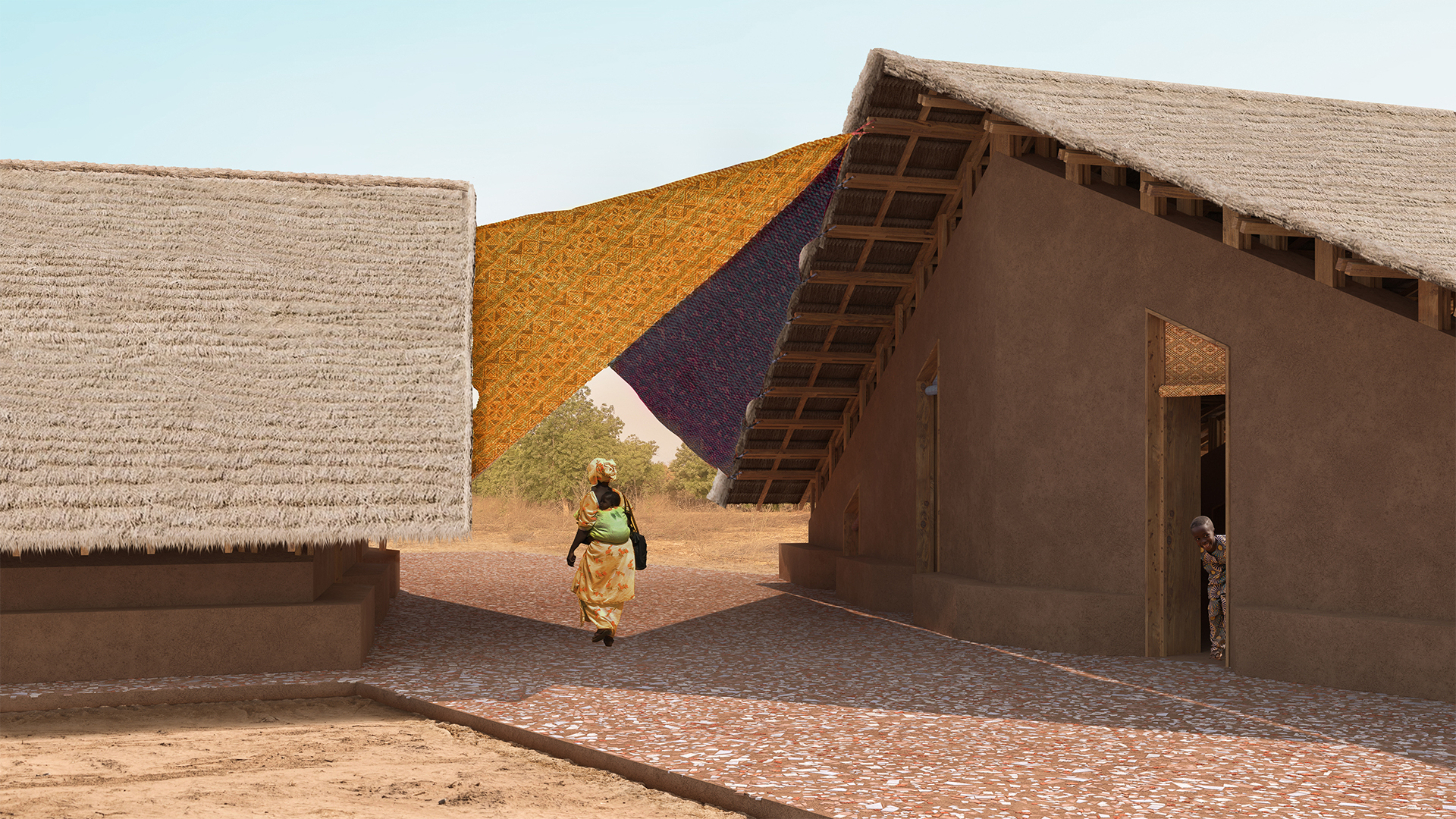
A children's home is proposed in the remote community of Baghere, Southern Senegal where serious problems with malnutrition exist in young children. The house aims to provide a safe and secure space for these children to be taken care of and recover physically and mentally. The style and shape of the buildings comprising the home are chosen to provide maximum shade and thermal performance. Colored external accents visible from the street communicate an inviting space to passing mothers and their children. Gradients of spaces from public, semi-public to private, achieved through shifted volumes make the design easy to navigate and create a balance between an inviting gesture, and a private retreat. The form of the volumes is based on regional climatic conditions. Wall angles reduce the area exposed to direct sunlight while the cantilevered roofs shade the buildings’ outdoor seating along the facade protecting it from heat and rain. Clay bricks staggered in the windows of the buildings provide air flow while openings under roof's eaves transport away hotter, rising air. The roofing, based on local traditional thatched roofing, provides effective sound and heat insulation with the ability to collect drainage rainwater into cisterns. The inviting nature and intuitiveness of the design guide users across a large courtyard (1) to the entrance of the southern building and opens into the administrative/organizational area (2). Attached to this area is the storage room (3), while the center of the building houses changing rooms (4). A large open treatment room (5) is situated directly behind the changing rooms. This treatment area can be configured depending on use and need. For children and relatives with greater, more acute needs the Northern building provides the option for longer term stays and care. The Northern building is accessed via a sun-protected intermediate area (6). A large shade sail spans overhead connecting the North and South buildings offering protection from the sun. The open, bright, and colorful design of the intermediate area is intended to encourage children to play and spend time here, whilst the adjacent childcare room (7) serves as a dormitory. The use of natural overhead passive lighting and textured, earth-toned walls in the childcare room creates a comfortable and quiet space. The center of the North building houses changing rooms and a restroom (8). Beyond the changing rooms and restroom lies a separate, large configurable bedroom able to house up to eight adults (9) A separate exit from this room leads to a private, rear outdoor area (10). The outdoor area provides shade and seating allowing children and adults a secluded, separate, and comfortable space. 2.HUYNGOVIE011206
Project by: Ngoc Huynh Thi Hong, Mai Vo Thi Truc, Kieu Nguyen Van, Khang Nguyen Van Hoang.from Vietnam

Design idea
As the functional name of the building, the children's house is a house towards children. The house includes main functional spaces for children such as medical examination and treatment space, dormitories, management area and a storage. In addition, from the point of view of our team, the house not only takes care of the physical body as the orientation of health care, nutrition and awareness-raising activities as the main purpose required by the organizers, but also be a place of spiritual care for young children. We believe that a project built for children should attract children and be loved by them. Therefore, this should be an interesting place to children as well as a place for them to have fun. Moreover, it will not only stay at the role of an aid station or a place to provide medical care and food. It also be a playground, a gathering place for groups of children, and a place to keep good memories for kids in this area. Due to the reasons stated before, the children's house has an extremely large lobby space. The ceiling is designed with vibrant colors to create excitement for children. The lobby space is large enough for them to have group activities comfortably. There are ponds at the entrance and outdoor hallways, filled by water from the roof after rainning. Not only this arrangement helps cool the building but also helps stimulate the children's observation ability by playing with water. The backyard are gardens, bringing a sense of freshness to the building, as well as an outdoor playing space for the children to be close to nature. Many high walls surrounding these courtyards help create shadows to keep the yard cool. It also acts as a barrier to protect the children's play space from people approaching at the back of the building. (The front of the house is controlled by management) Besides the lobby space in the middle of the building, the remaining functions are divided into two sides. On one side is the public area, which is used for medical examination, food distribution, and dormitories for children and parents who live far away. The other side is a private area, which is a workplace, training room for management, and storage with its own entryway for taking goods without affecting the activities in the main lobby space.PALDAVCOL224724
Project by: David Palacio, sebastian goméz, sebastian restrepo, maria isabel muñoz, maria clara montoya .from Colombia

Design idea
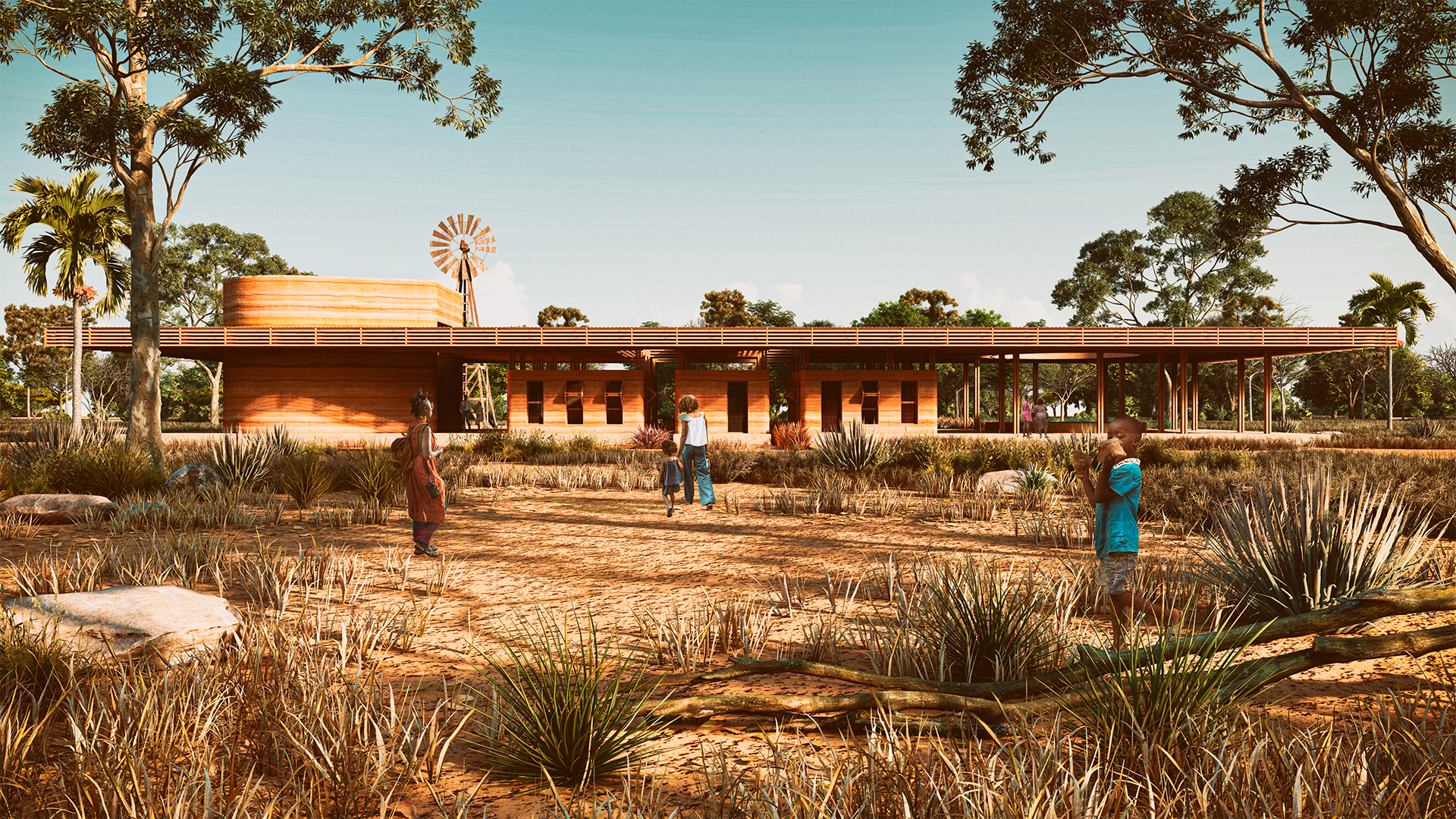
Children’s house is a project that aims to prevent child malnutrition in Baghere by making constructions that balance form, program, place, materials, and technique. The project’s objective is to cover the community's nutritional needs and related activities by creating spaces for learning, production, playing, entertainment, and resting which are essential to become a community center. The project consists of an oblong volume tensioned by two areas placed at each side. To the north, the children’s area is a stereotomic reflection of the relation between the kids' bodies and space. In this volume, a series of caves is generated with the objective of responding to materials and body positions necessary for early motricity stimulation. The second space is located to the south of the volume and is a modern reinterpretation of an impluvium which is destined to be a resting, entertainment, and meeting area. Bioclimatically, this way of using the water improves comfort within the space at the same time it allows to gather water for dry seasons. Finally, at the center of the volume are the functional zones of the nutritional prevention center which is developed in two phases. First, we have the ambulatory care with nursery, administration, and psychology. Second, we have the reception phase with storage, feeding, cleaning, and shelter. Behind the center, the orchards that make up the food safety program are built. We start with composters that are assembled to store the organics disposals used in the project which will be used to produce arable land and food for the Children’s house. Children’s house provides the fundamental infrastructure to reduce child malnutrition and give support to the families to take care of children in an interdisciplinary way combining architecture, bioclimatic interaction, social labour, and peasant workhand without leaving behind childish playtime and recreation.PAPANTITA120508
Project by: Antonio Papa, Kaveh Raesi.from Italy

Design idea
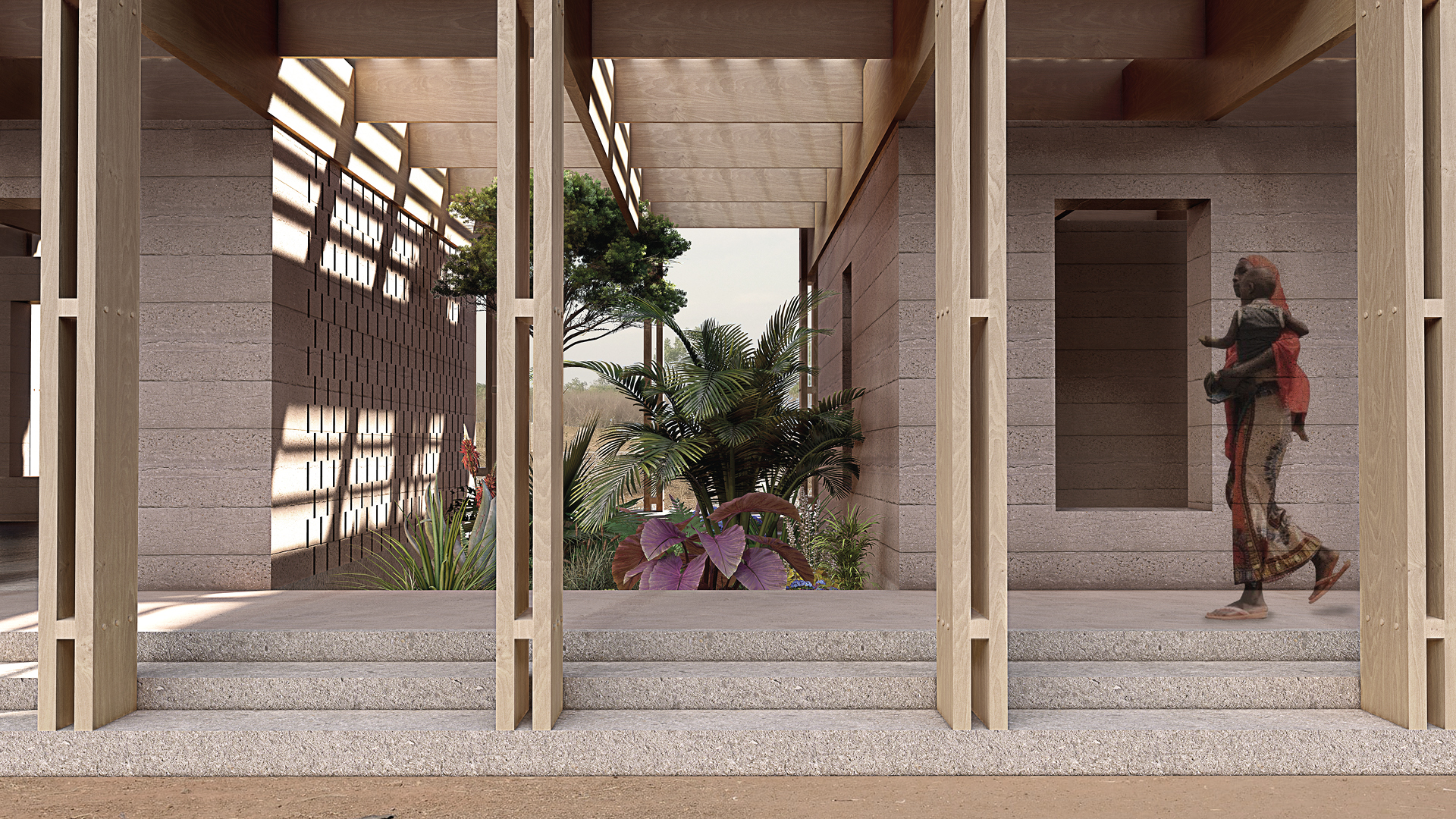
The main idea of design of a children's house has taken shape in response to a list of parameters including morphology of local architecture, climate, cost and method of construction. The form of the building is driven in corresponding with its landscape and so expands linearly. The morphology of vernacular architecture and the function of the spaces lead us to maintain regional-architectural identity, so the spaces are formed such as a small village; composed of three separate volumes with rectangular plans that have been extended in the north-south axis, through the roof and the basement on which are located. They maintain their continuity and unity. The spaces are located in the central and southern parts are dedicated to Children’s medical examinations and hospitality -in relation together-, while the administrative and storage parts are in northern wing, separated through botanical gardens. The ellipse-shape sandbox connects two volumes that is a recreation space for children to play and to be observed. Regarding in getting the maximum efficiency as a solution to the existing climate conditions, the first step of approach refers to the building orientation. Therefore the vital key to consider is the wind direction in different months. It bellows east-west and vice versa, so the long side of the building is in the east-west direction to use wind advantages in ventilation.PETMELGER261999
Project by: Melina Petavrakis Eisinger, Viktor Kalinov, Ayris Findik, Tsvetelina Markova.from Germany

Design idea
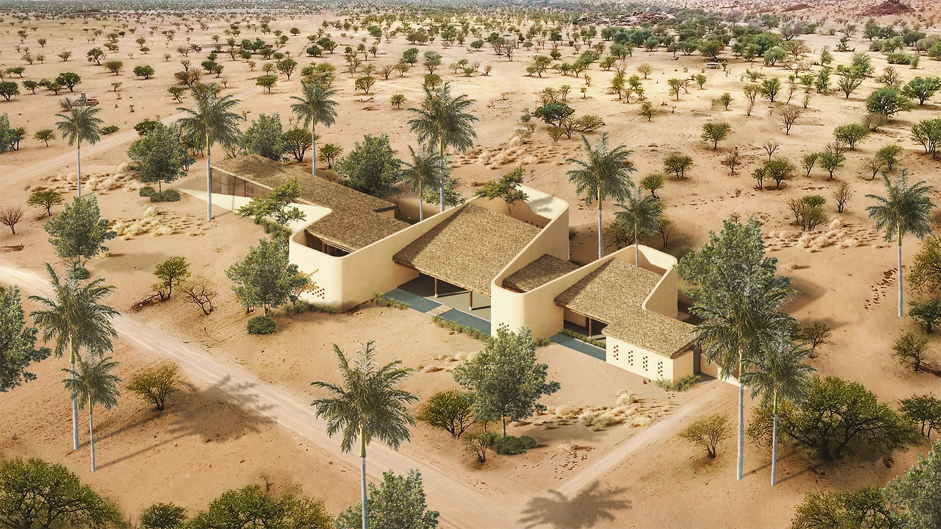
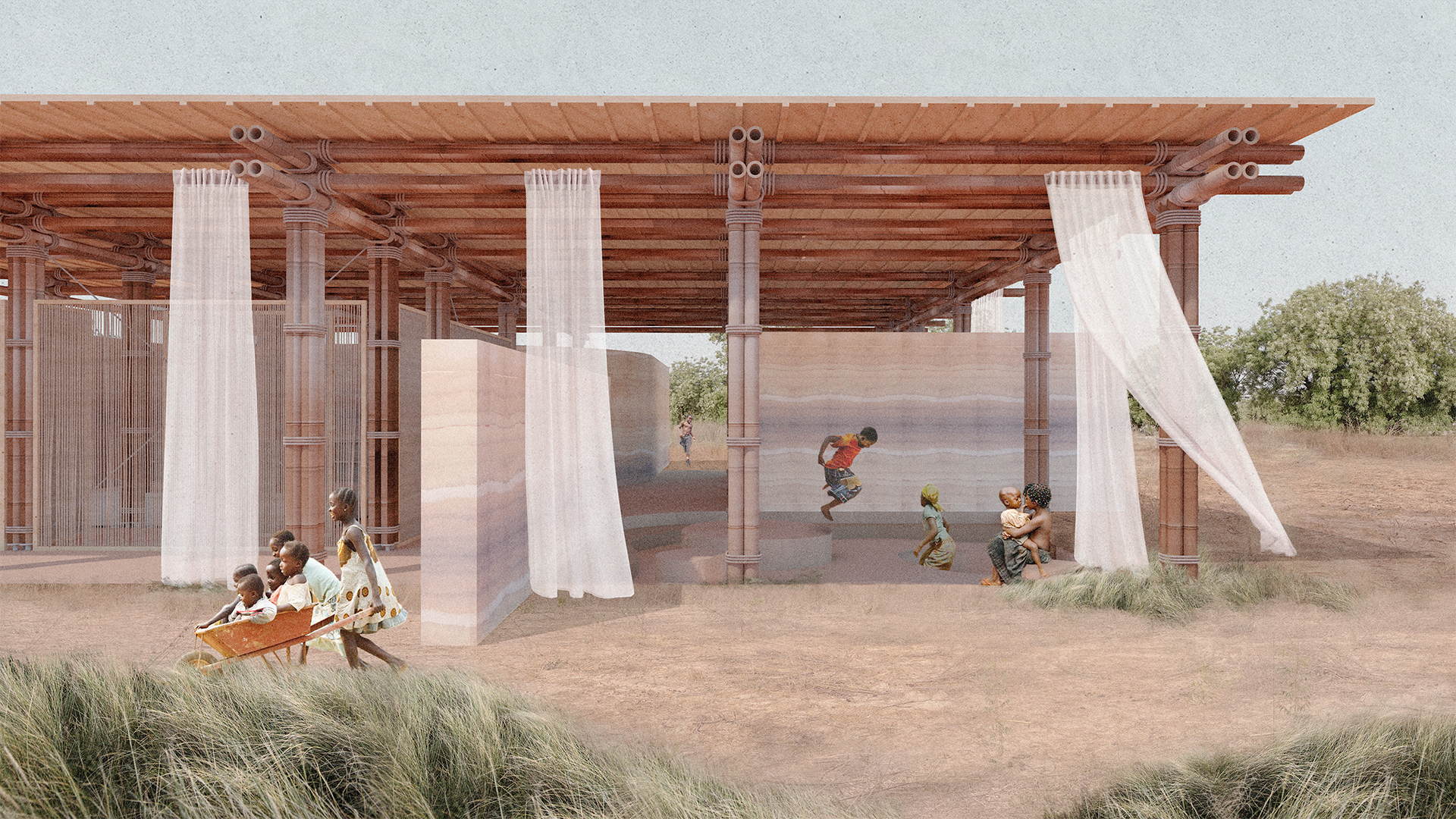
In the village of Baghere, architecture interacts closely with the earth and nature. The vernacular structures of the Southern Senegal region are built usually with local natural materials and provide the basic comfort and security for the natives. They are adapted to the climate and the village way of life, embracing the simplicity of the human’s life and the importance of gathering and social exchange. The Children’s house, laying in the sandy-clay landscape of Baghere, is located close to the road assuring its welcoming appearance. Standing firmly on the flat scenery, the structure establishes an interaction with its surroundings, providing a safe space with a warm atmosphere, where malnourished children can get the needed physical and psychological support. The Children’s House respects the importance of the earth as the main source of nutrition and integrates it in the building process. The symbolism of it incorporates several meanings - strength, nurturing and growth. Therefore, our proposal aims to achieve a sense of stability and groundedness in the structure’s atmosphere and functionality by using clay as one of the main building materials. Earth is being excavated, creating a topographical site, then elevated into space-forming walls. Their strongly natural character and the topography stand for the connection to nature and the importance of healthy nutrition, while creating a unique and playful atmosphere for children. In contrast to the dynamic base of the Children’s House, the roof with its light fabric elements creates not only the feeling of protection but also metaphorically symbolises the hope for health and prosperity. These two main elements of the concept - the floor and walls with their dynamic movement and the regular bamboo grid and roof create a productive dialogue for the scenarios in the building. The clay walls define the different zones of the building. On the side facing the way, the wall marks the entrance, guiding the visitors with its movement along the administration room with a kitchen and storage to the core of the house. The round gesture of the main wall surrounds the community space in south-western direction, oriented to the village and relatively connected to the road. The topography slightly leads the actors into this area, where everybody is directly invited to participate in educational events, discussions and exchange of knowledge. Towards the inner side of the building the clay wall encloses the hospitality area, contributing to its sense of security. It includes a dormitory with eight beds and a flexible room for medical examination, sanitary needs or changing rooms. The unity between it and the administration area considers the coordination of proper medical care. A crucial part of the concept is the recreation sector that lies in direct vicinity of the trees in the upper side of the plot. The connection to a green area has psychological benefits for the mental skills like memory, attention and creativity. Moreover, specifically for the malnourished children it would have a major positive influence on their mood and feelings. Another aspect of the recreation zone is the bubble-like topography, which enhances the imagination and offers diverse suggestions for use or play. The Children’s House is relatively open and free-shaped, establishing an organic connection with nature. The interaction between the textures of the used materiality, the wind peacefully moving the light fabrics and flowing through the bamboo structure, as well as its sound, the play of shadow and light through the partition walls out of wild bamboo activates all senses. This creates a unique space, where children could find help on their way to a proper nutritional development.SIEJULPOL271202
Project by: Julia Sielska and Gabriela Gustaw .from Poland

Design idea
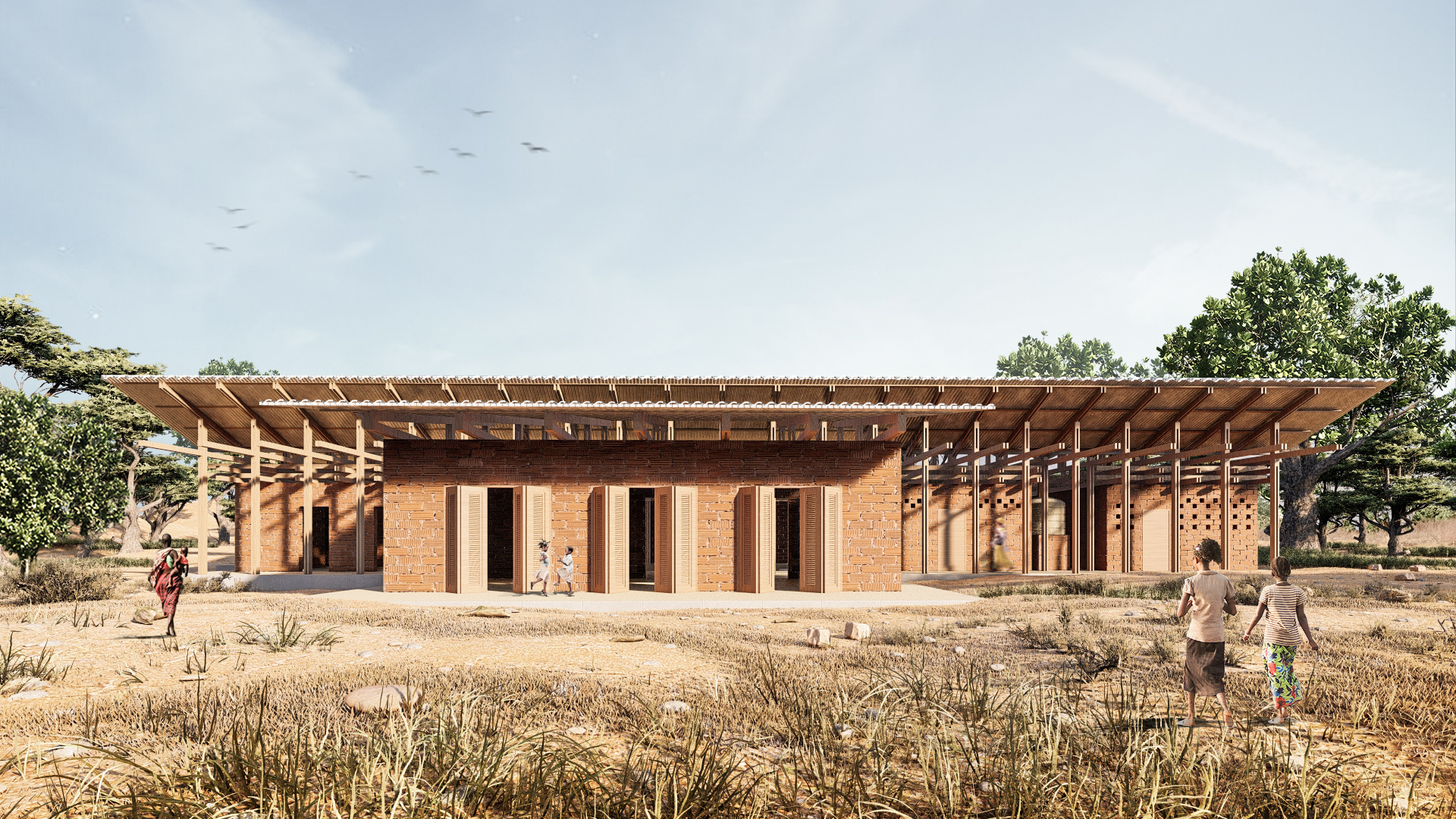
We set ourselves the goal of creating not only the architecture, but also the entire space as a place conducive to peaceful recovery. The most essential thing for us was to make use of given conditions, however we also focused on the reception of the object adjusted to its function. We wanted it to fulfill necessary purposes, allowing at the same time for rest, work and educational activities. The main idea of our project is to create architecture that uses the environmental conditions of the place. This is the most important part of the whole, which implied most of the design decisions. By conducting analyses and studying the literature, we were able to bring out the most crucial aspects to which we had to pay attention. First of all, we focused on the use of wind and its potential. In this geographical location, the north-eastern wind is most common, so we oriented the building precisely in this direction. Thanks to this, the wind will pass through the buildings and their surroundings, at the same time bringing with it a pleasant refreshment. Additionally, it is influenced by the fragmented character of the development, which allows for better ventilation. The shape of the pitched roof and the positioning of the windows at certain heights also make it possible to regulate the movement of air. In this way the wind is caught and directed into the interior. It was very important to adapt the features to the airflow. We located the hospital part on the north-eastern side, the most convenient in terms of ventilation. Thanks to such arrangement this zone is also delicately separated acoustically. Air movement also determines the location of the toilet. We wanted to make sure that unpleasant smells would not disturb the usable areas. Therefore, the toilets are located as far as possible, but still at an accessible distance. Due to the character of the geographical conditions, we decided to use composite-dry latrines, allowing for hygienic use without using water to flush. It should also be mentioned that the northeast orientation is a very favorable arrangement due to the sunlight. In order to negate the temperature and effect of the sun, we followed the principles of Passive Solar Design. This is another reason why cross ventilation and appropriate zoning of the building functions are of particular importance in the design. In addition, we focused on a practical way of shading, which not only covers the development modules themselves but also covers the external utility courtyards. The roof itself allows for water drainage, especially during the monsoon season. The use of natural factors during the design process inspired us to create a space modeled after nature. We were particularly interested in recreating an environment where people feel at peace as if they are in nature. Therefore, we left the materials in their raw form while keeping the structure unobstructed. The truss and post system are reminiscent of a forest. It was very important for us to introduce courtyards between buildings, which would direct users to the inside of the whole assumption. It is in accordance with local design tendencies. Additionally it allows to create covered outdoor space. Courtyards differ from each other in character - one belongs to recreation and training zone, while the other allows to spend time in a more peaceful way. We based the whole composition on linear axes, which are marked by walls of particular modules. Thanks to that, tunnels directed towards the green were created between the buildings. Modularity was also important for us, which promotes possible changes in the function of rooms.KIMJINSOU300621
Project by: Jinho Kim.from South Korea

Design idea
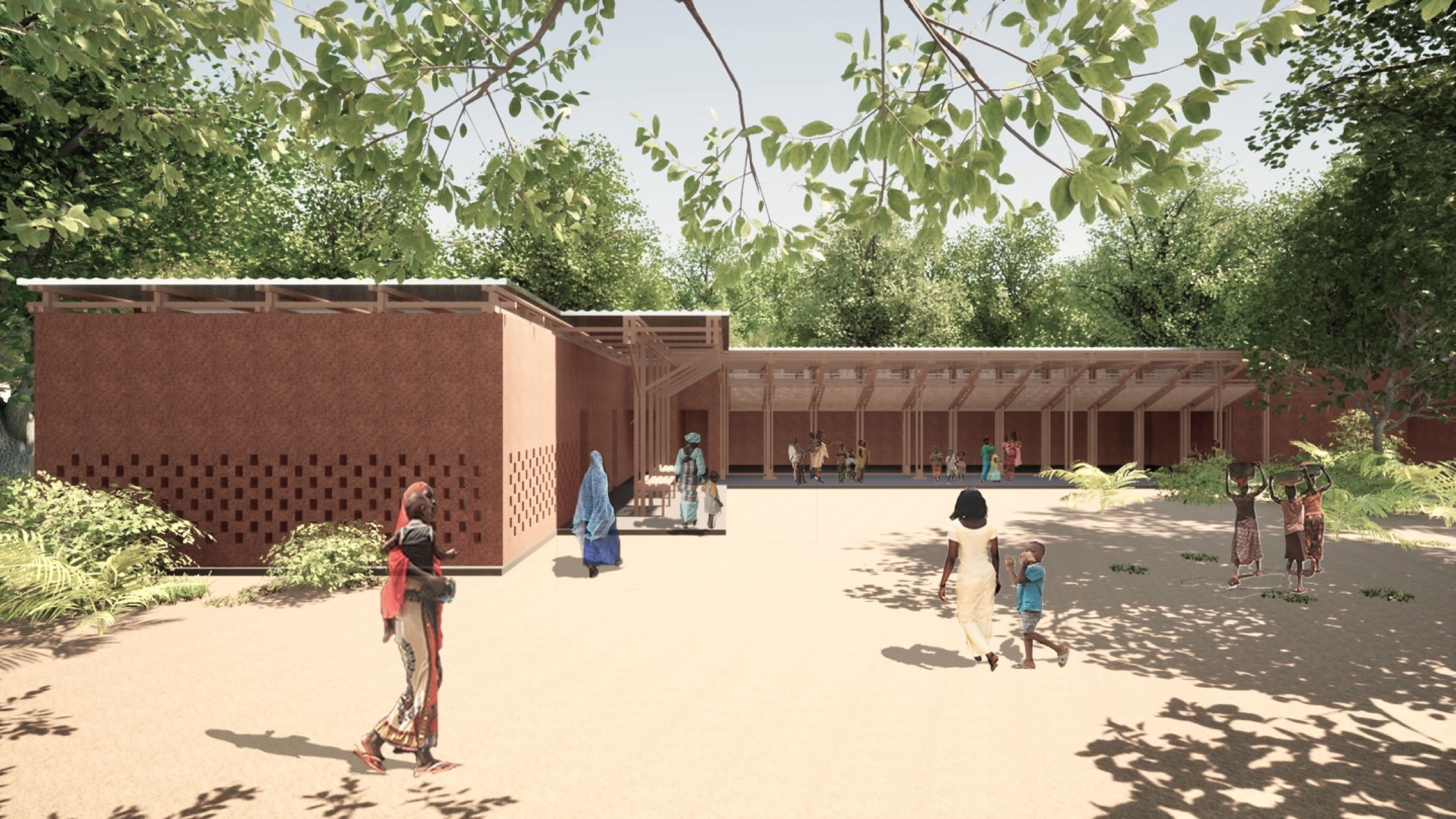
The focus was on designing a flexible space by mixing the wooden structure and the masonry structure in consideration of the characteristics of the child in the dormitory. In domitory, doors are arranged in the foot direction of each bed. They can be folded vertically and secured to the rafters to create an open plan. Also, the wall formed in the due-north direction, protected children from nature in the northeast, and made the outdoors yard more private, enabling public activities. The structural advantage is that the woodwork is constructed as a support point for the brick wall. The rafters block Senegal's strong sunlight and protect its wooden columns from rain.YANPATTHA274080
Project by: Patsakorn Yan.from Thailand

Design idea
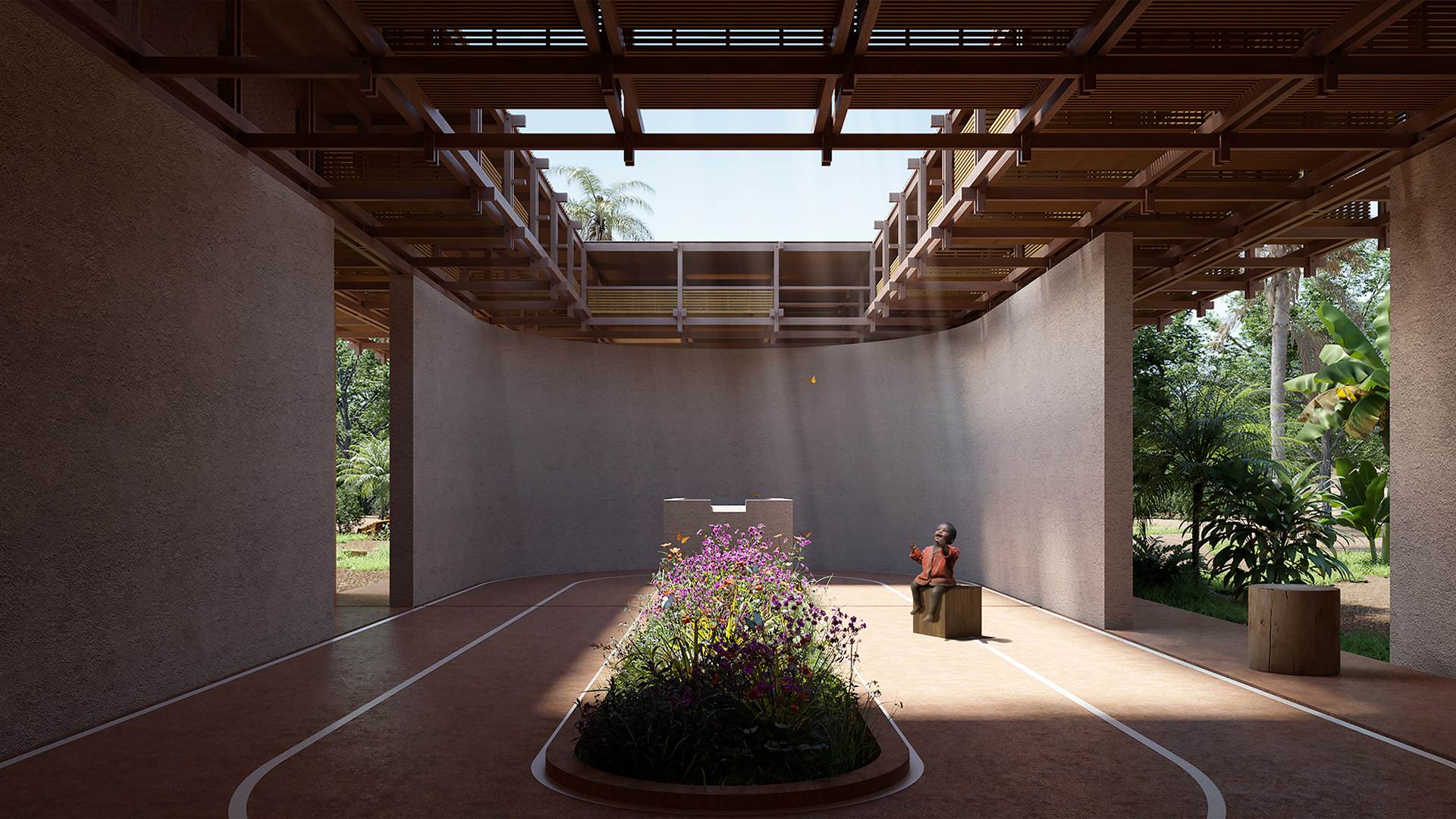
Have you ever heard that children are like white cloth? Those kids can change the colour according to what the white cloth finds. A child should have fundamental rights when every child is born. The first right is protection from discrimination - harassment, abuse, bullying, neglect, neglect. The second right is the right to development is educated both/informally, personality development both socially and mentally, Developing physical health. The third right is to participate in expressing children's views and to have a role in the community to express opinions on matters affecting children. Moreover, the last right, the fourth right, is the right to survive and promote life, receive good nutrition, receive love and care from family and society, receive health services and provide correct life skills. Thus, the fundamental rights of children were adopted as an idea to create an architecture that promotes children's life by using the most critical area for the children. This Recreation area will help in the fundamental development, whether using your body, using your brain or spending time with friends. To promote the development and participation of children who come to use the building, it also considers the rights of children's survival and the right to protection. The building will supplement the child's health care and the child's mother. Moreover, food and medicine are adequate for the overall supervision of fundamental rights by creating a Hospitality and Storage area next to the Recreation ground where the sound and happiness and support of other children can be passed on to another child, and there is a connection between the area. In addition, the construction also brought the original architecture of the landscape to be used. Two things are to keep food and supplies in dry areas under the roof away from the humidity of the ground and the construction of thick walls to create a distance from the heat of the outside air entering the project and create an opening to allow the air to flow at all times for comfortable use.MAUDEMITA211998
Project by: Demetrio Mauro, Francesca Picchio.from Italy

Design idea
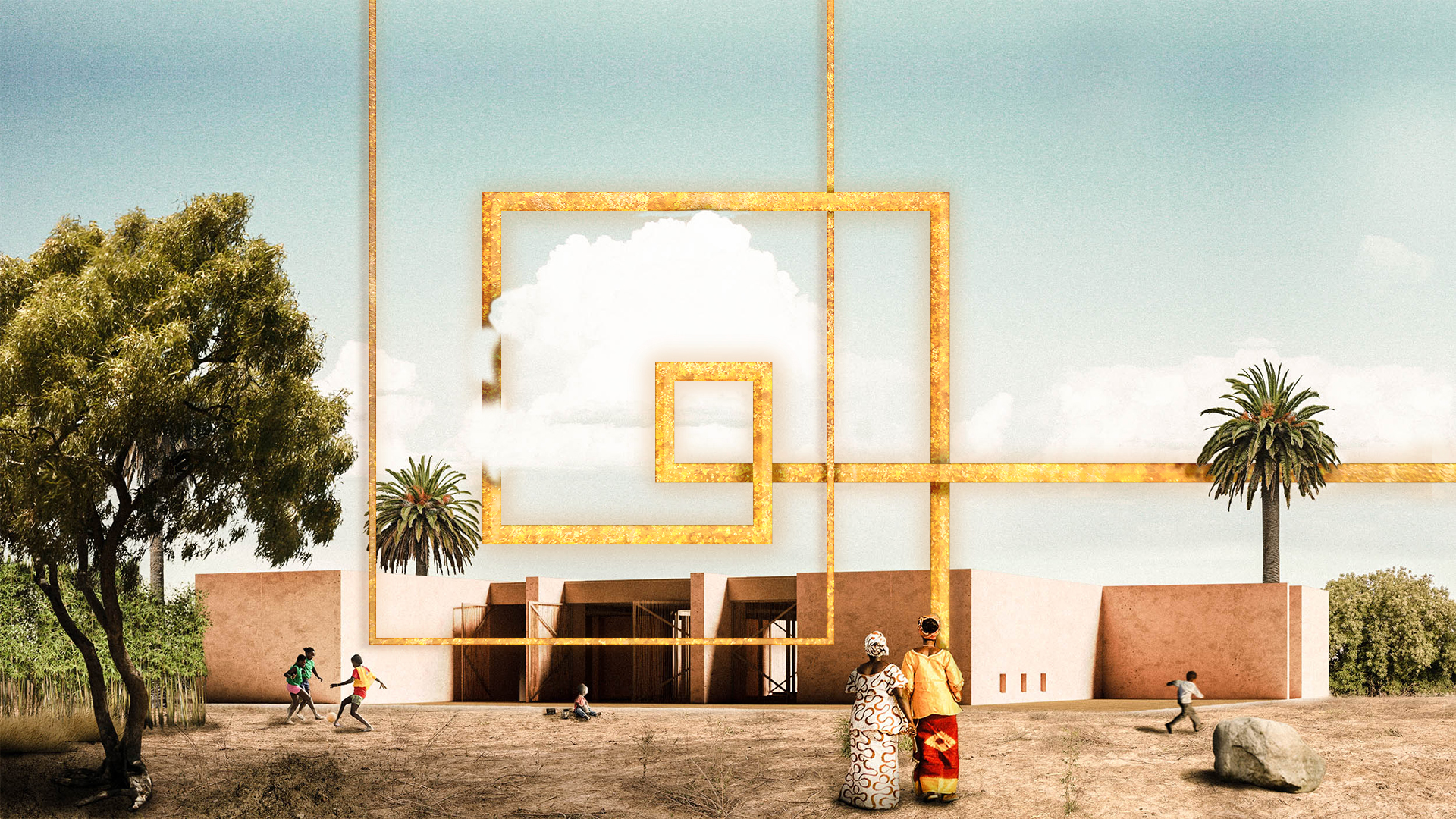
The project idea takes inspiration from the preliminary analysis carried on the area’s climate and traditions, while taking into considerations the children’s needs. The analysis reveals that the temperatures during the year range between 17°C and 38°C, and that heavy rain seasons alternate with drought ones. The driest season lasts eight months – from October to June – while the rainy season lasts four months – from June to October. The shape of the building is therefore inspired by the need of a fresh and snug place, resulting in a compact and introvert one; in order to search for a contact with the context, three perimetral walls have been extended towards the external environment. Taking inspiration from the roman domus, in the center of the building, as the cornerstone of the whole project, it is possible to find the impluvium – an open space that makes possible to collect rainy water – around which the various spaces are developed: a play area for children (84mq), dedicated spaces for offices, administration and meetings (55mq), the hospitality (90mq) and the warehouse (19mq). The arium, that is the connection space between the other rooms, is open but covered, so that it can be used for the various activities needed within the use of the children house. Using the communicating vessels principle, it is been decided to distribute the water collected from the impluvium into three small water ponds located one each in the arium, in the children’s playroom and in the space dedicated to the administration; so as to allow the environments to refresh. From the big water collection tank, through various water pipes, the water flows inside some decent size containers placed underground and, later, also through a number of pipes, it reaches the water ponds. In order to embellish and cheer up the rooms, while keeping in mind the area’s traditions, the drapes and carpets manufactures would be made using local fabrics, while the exterior it is planned the planting of local trees and plants able to shelter the building from direct sun rays. To help counteract the disappearance of bamboo plantations, our intention is to plant a new bamboo plantation within our site projectABERYOJAP082222
Project by: Ryo Abe, Mahia Mustary, Dhishan Rahman.from Japan

Design idea
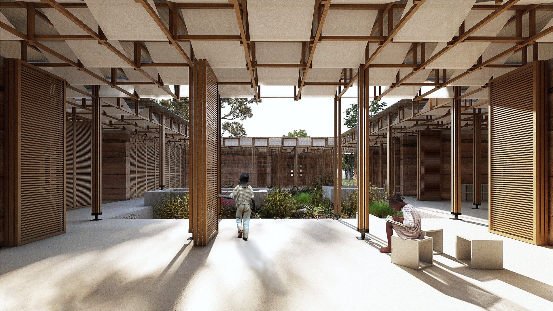
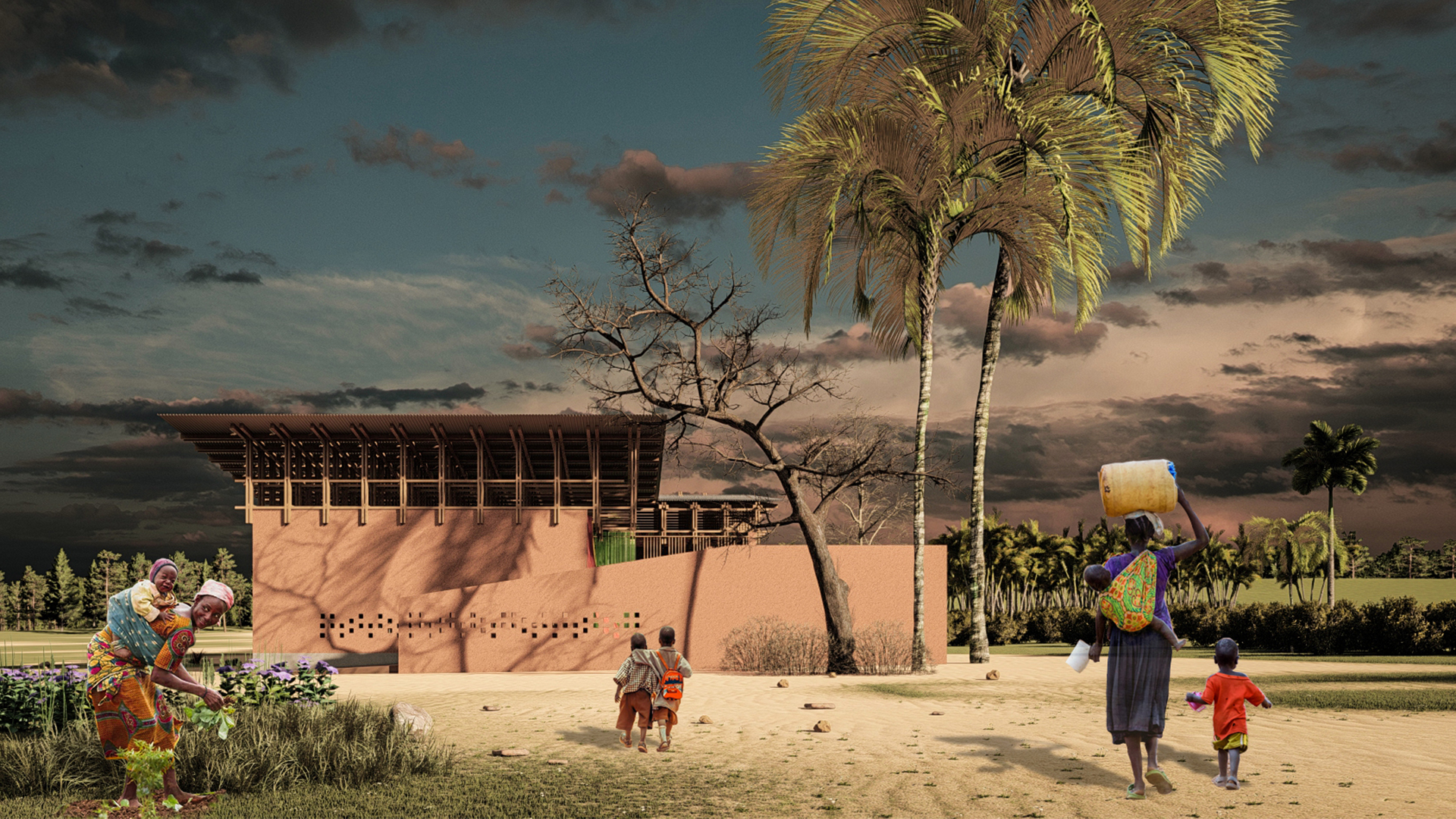
The children’s house in Baghere village is designed to accommodate the monitoring and assistance for children at the risk of malnutrition. Our goal was using the design process to address this issue along with its climatic features and make it more context effective. The design framework focused on shaping their traditional beliefs to a modern form. Rainwater collection and embracing it through the space was the central feature of the design process. A bamboo rain installation is designed to celebrate this natural phenomenon. The water gets collected to the venetian well where it is purified through natural methods like the layers of sand and gravels. The sunken space around the well gets dried in absence of rain so people can sit around and gossip. The roof system is designed to create a rhythmic ambiance of the falling water in which the hope of receiving fresh water is cherished. The wooden structure beneath holds the primary layer metal sheet outside and local fabric as the secondary layer inside. This double layered roof system protects the indoor from direct sunlight and guarantees a diffused and soft light inside the building. Rammed earth walls are designed with perforations in a rhythmic manner like the falling of rain to ensure the stack effect. The building is positioned considering the local monsoon and microclimate of the site. While designing the interior spaces, child psychology was kept in mind. Small niches in the wall hold the wooden boxes with books. The boxes can also be kept down and used as sittings. The building is designed to be compact considering the harsh weather outside but the shallow waterbody around the well will keep the inside environment comfortable. Within this, the program is articulated such a way that it creates an immense dialogue between indoor and outdoor spaces ensuring a playful environment. The sound of rain in the roof to the shallow pond in the monsoon, the interplay of light in the dry season, the overall sense of sound, light and water all are tied to the African tradition to create a playful space for the children.CASSANSPA182022
Project by: Sandra Castro, Laura Sánchez Manzano, Belen Siverio.from Spain

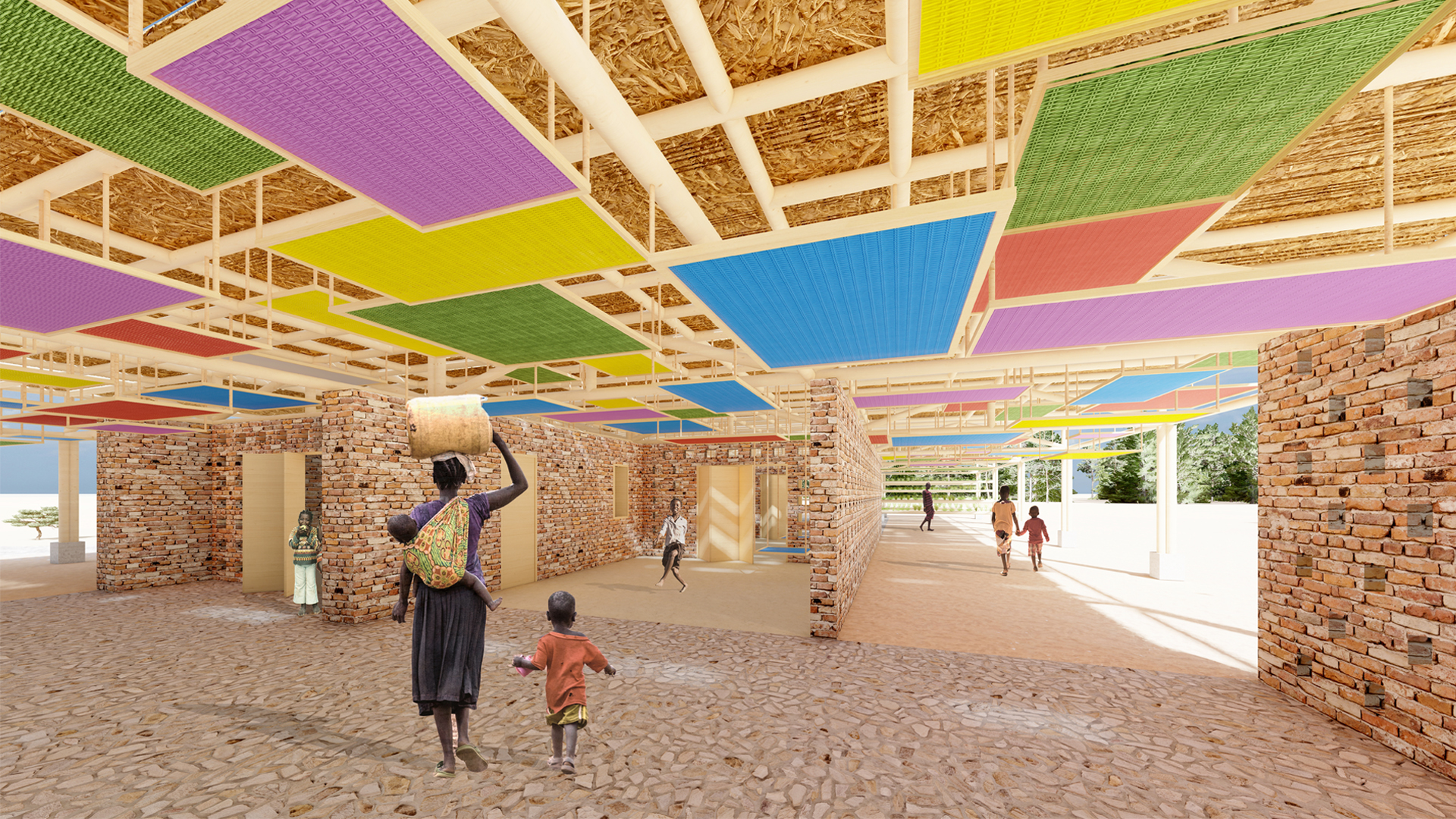
Design idea
The fundamental concept that articulates this project is nourishment as a basic necessity for life. NU-, the root of the word, comes from the Indo-European root NA-, which means dripping, moisture or breastfeeding; the basis of life. Mothers, therefore, are the fundamental pillar on which the design concept is based, and it is that the lack of access to optimal nutrition and health care for mothers, since pregnancy and lactation, is one of the fundamental factors that affect health, both physical and psychological children. Thus, "The Children’s House" becomes "The Children’s and Mothers' House". MOTHER is then projected as a self-sustaining and self-constructive place, a place of welcome and closeness, where both children and mothers can develop training activities against malnutrition, as well as a place where nurses and pediatricians can monitor risk cases in their facilities. The main factor for the construction of a sustainable and energy-efficient space is the strategic design of the building in its relationship with the place and its climatic conditions. The sensation of embarrassment and almost unbearable heat are widespread almost all year round in this area. That is why, it is proposed, the location of the project in the southeast area of the plot proposed in the statement, where there was currently a greater agglomeration of mangoes and acacias. The objective of bringing the project closer to its southern perimeter is to use existing vegetation as a climate barrier to improve the well-being of its occupants. In addition, the project takes advantage of the direction of the southwest wind, which predominates in the Tanaff Valley almost all year round, to propose a development of walls/lattices whose openings are oriented southwest-northeast, encouraging cross ventilation inside. The project is proposed as a cover of multiple overlapping layers, formalized its structure with bamboo vulgaris, which rests on the walls/ lattice and pillars, which, in addition to carrying out its function of covering and protecting from the sun and rain with its outermost layer, houses the possibility of hanging from its lower level panels made with locally dyed bamboo fence of different colors, placed at different heights depending on the function they perform: as beds, small tables for children, or located at a considerable height away from the ground as food storage. Another determining factor to improve thermal comfort is the inclusion of low-cost hydroponic crops, taking advantage of the excess cuts of bamboo canes used in the roof structure. Such crops can provide sustenance for the nutrition of children as an alternative to problems due to desertification and salinization of the land, with large losses of arable hectares, and the inability to cultivate in nearby contaminated soils, turning out to be a significant source of diseases that aggravate the problem of widespread child malnutrition in the region. Under this roof, three types of walls/lattice organize the space into two main bands, differentiating areas according to the layout of the walls and their connection with the adjacent spaces. In these spaces the required program is located, giving the possibility to increase and directly interconnect the main spaces both among themselves, and with theserver spaces, as with the covered exterior when opening the large folding wooden doors that project. Thus, the MOTHER cover is the fundamental constructive element of the project, which through the use of appropriate materials ensures the well-being of its occupants, an indispensable factor for the safe and comfortable reception of people.EMAAHMEGY084493
Project by: Ahmed M. Aglan, Haridas Narvekar.from Egypt

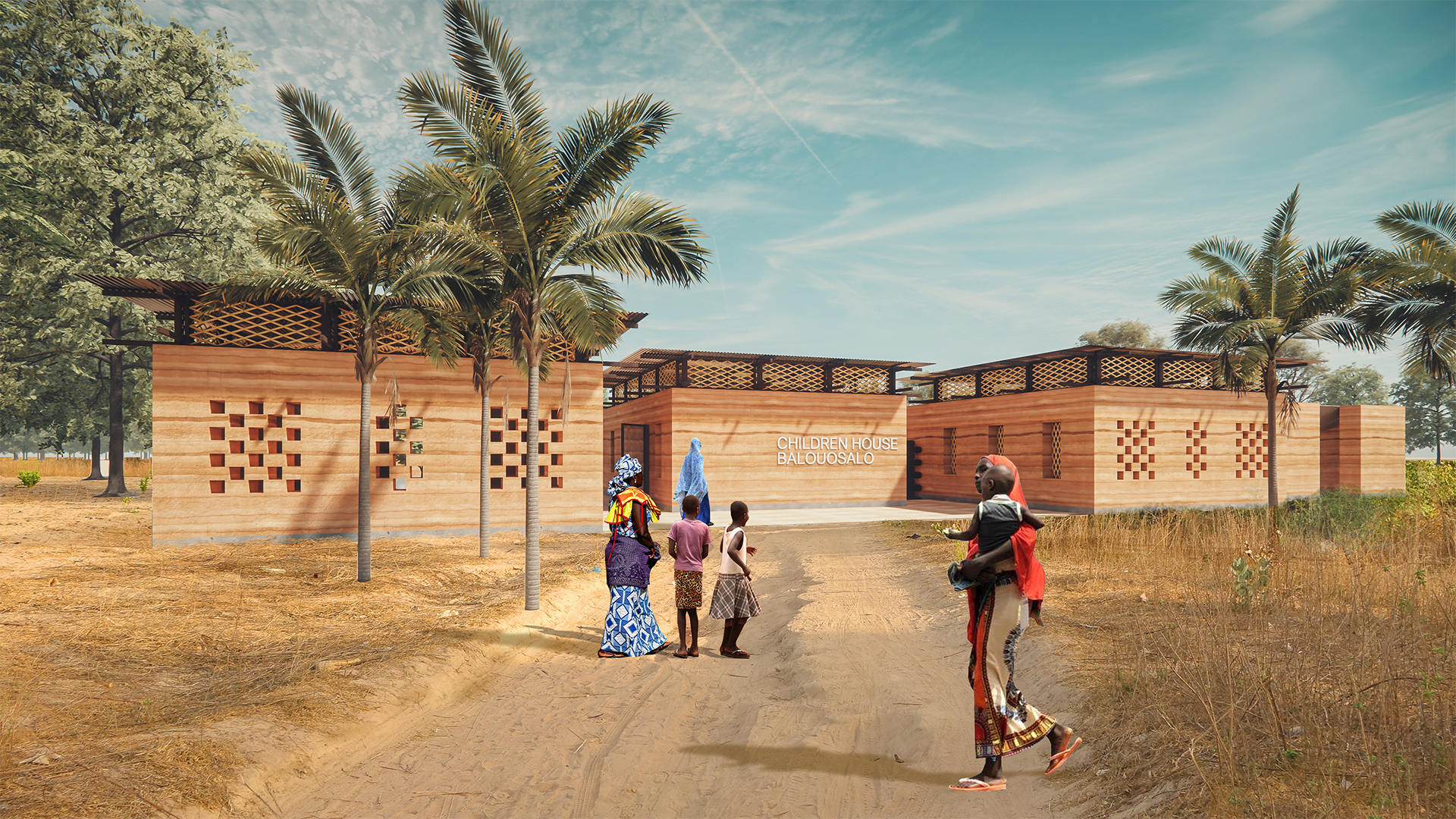
Design idea
Our design concept is inspired and constructed to take you on a journey of hope from the moment you enter the Children’s House, to the moment you leave. The children will be able to experience this hopeful journey through the use of the space in different stages of their recovery. It all starts from when they walk into the door, where they have an open and safe space, with various courtyards, picturing themselves playing and running along those pathways when they’re healthy again. As more children come in, they will find other children playing around, children who were once in the same situation when they walked through the door. Senegalese architecture is known for its simplicity, therefore our design key was to ensure we respected the architectural environment. The Children’s House is comprised of 3 main zones that are connected with internally secured pathways. The first zone has an administration located right next to the entrance, followed with a storage area and prayer room. The second zone serves as the hospitality area, which is located at the center of the project. This area is close to the administration space in order for it be easily controlled and accessed. The third zone has the treatment areas where the children will go through a stabilization treatment, a transitioning phase, and finally, a rehabilitation process. This is therefore reflected in the plan; there are 3 spaces that will be responsible to treat the children. The site is separated into modules, each module size is 28x6m. There are two main reasons for creating modules; the first is to be able to easily repurpose the spaces in terms of functionality and site location or size. The second is to accommodate future expansion, which was the reasoning for using a temporary material instead of a structure wall. Each module is split into masses with a shared courtyard at the center to function as a recreational area. The courtyards get bigger with every module to emphasize the transition between the treatment phases. The folding doors allow for a shared indoor and outdoor area, all of which can be opened to become one communal space, where all the children can be connected. All spaces are naturally ventilated by adding openings in the wall. Moreover, the purpose of including voids in the walls, roofs and windows is to allow for natural light to come in and to reduce the use of electricity. As they regain their energy, the children will be able to discover how to stay healthy through different programs, and especially through the on-site farm. The farm’s purpose is to sustain the Children’s House with its dietary, financial and educational needs. After they receive medical treatment and complete the rehabilitation phase, the children will be able to learn how to plant and grow crops, as well as learn what dietary benefits come from what it is they’re growing. They will learn how those crops are prepared for selling through the produce store, so that they can benefit from this experience and possibly sustain themselves once they leave the House. The roof has a slope of 2% towards the farms and the courtyards allowing the grass to be directly watered by rain water. A water collector was constructed on the site to collect the intense Senegalese rain water, to be re-used. Through this experience, the children will also learn how to be part of a collaborative community with a common purpose: keeping the Children’s House running to help those who are just like them.SARRAJBEN080314
Project by: Rajaa Sarout, Tsadok Majoie Kpoviessi.from Benin

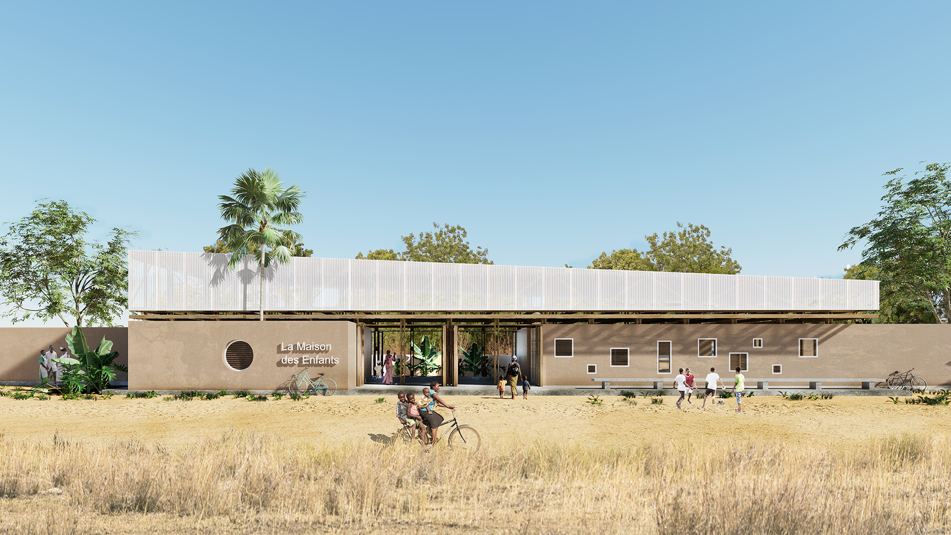
Design idea
Today, one in three children under the age of five, is affected by malnutrition in one if its most visible forms. Designing a Children’s House, that can raise parents’ awareness and help children at risk of malnutrition, is an exercise more important than the simple search for a fascinating shape or geometry. It is a challenge holding an important social and humanitarian meaning. Because a child is a source of life who illuminates his surroundings, his family, his neighbourhood and even his village… with a simple smile, our project intention from the beginning for the children's home was to design an architecture with a strong identity. A strong and unique identity to express this soft and warm energy that a child can release. We strongly believe that a Children’s House that responds to this humanitarian mission is expressed by this quote: “The children of today are the leaders of tomorrow; allowing them to develop properly is essential in order to build a better future”. Therefore, any inhabitant of the village or the municipality who walks in front of the Children’s House, should get this message through the architecture of it. To achieve this, we observed first the habitat typology in the village of Baghere and a formal structure was quickly obvious for us. Each house or equipment, although similar in the building elements, expresses a different elegance in the shape of their roof (whether traditional or modern). Our goal was to express the identity of the Children’s House through the roof’s design. As a result, we developed a trapezoidal roof that represents the pure and simple appearance of a child’s growth until adulthood (starting from the small height to the great height of the trapezium). This guideline took us then in the spatial organization of the spaces of the architectural program. The hospitality area takes place under the low height of the roof representing the child receiving care to grow well. Recreation, consultation and awareness spaces are in the middle representing the tools necessary to maintain the child’s growth; the administration and storage spaces are under the great height expressing the child well-nourished who becomes an adult and a leader to accompany his community. We redefined the geometric figures present in the traditional architecture of the village; the spaces fit together and are connected and layered depending on the time of the day. These spaces play either with light and shadow, inside and outside, extension and encounter, intimacy and transparency, sharing and appropriation. Then, an exterior semi-circle provides a warm space to reinforce the idea of protection. Like a harmonious melody played by a griot, the whole project blends into the tropical vegetation offered by the Tannaf valley, which we hope will help the children regain strength and watch after their stays/passage within the house of children.VAEMOHIRA231792
Project by: Mohamadreza Vaezi, Niloufar Raouf Vala, Sina Vatandoost.from Iran

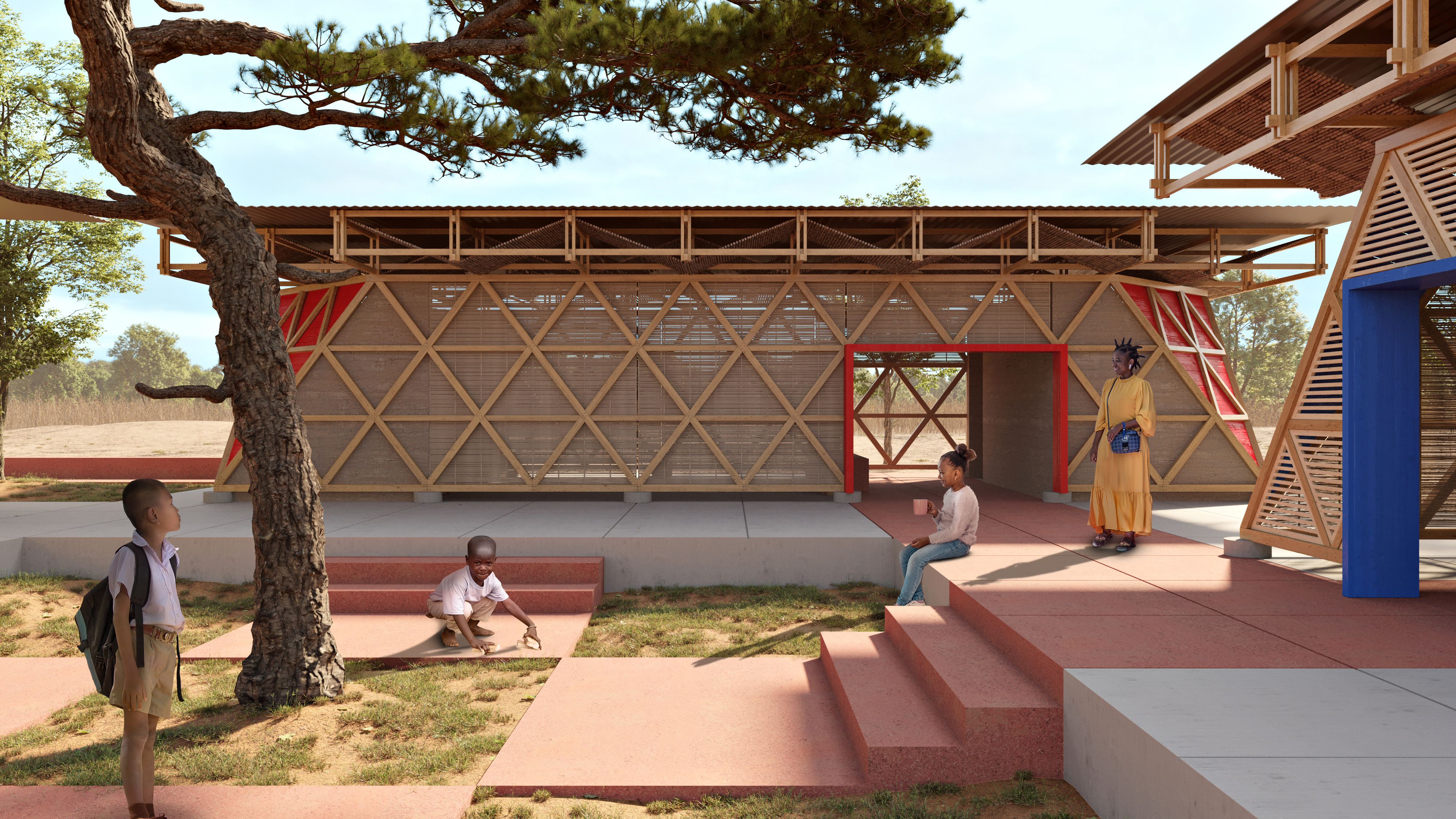
Design idea
Malnutrition, at its core is a dietary deficiency that results in poor health conditions. It is majorly caused by poor quality diet, lack of physical activities, etc. Children’s House is a place that deals with this problem. The main idea behind it is to provide an environment rather than a place, creating an enabling environment that promotes physical activity, ensures children's food security and their healthy diets, where children can feel safe, take part in activities, enjoy and feel like home. On the other hand the quality of their food and activities is monitored by the authorities. This environment takes its roots from cultural references and the “African life style” shaping a compound that includes three cells and a courtyard. This traditional solution helps to optimize climate conditions, and also merges indoor and outdoor spaces. Another feature extracted from the African life style is "Flexibility" and "adaptability". Flexibility of spaces can translate into “No limits, and only boundaries to distinguish”. Not only this feature helps the circulation to flow and never stop, it also helps to have adaptable spaces. For instance, two Separated classrooms can turn into a spacious gathering hall, only by pulling aside a partition. In every step of the design “children” and a “heaven” for them were considered to be the pivotal factor, so even the structure is designed in a way that follows the same idea of “No limits” where “Structure and Walls” melt together and shape a “semi-transparent diagonal system” letting the light and colors pass through. Another point taken into consideration is the importance of colors. In African culture, colors inherently have a symbolic nature. We can benefit from this point by using vivid colors (Red, Blue and Yellow) to make each one of the three cells distinguishable.DAUMUHIND140222
Project by: Muhammad Anshori Daulay, Dariyan Arya Wijaya, Harry Aldiansyah Nasution, Khairiza Sakina.from Indonesia

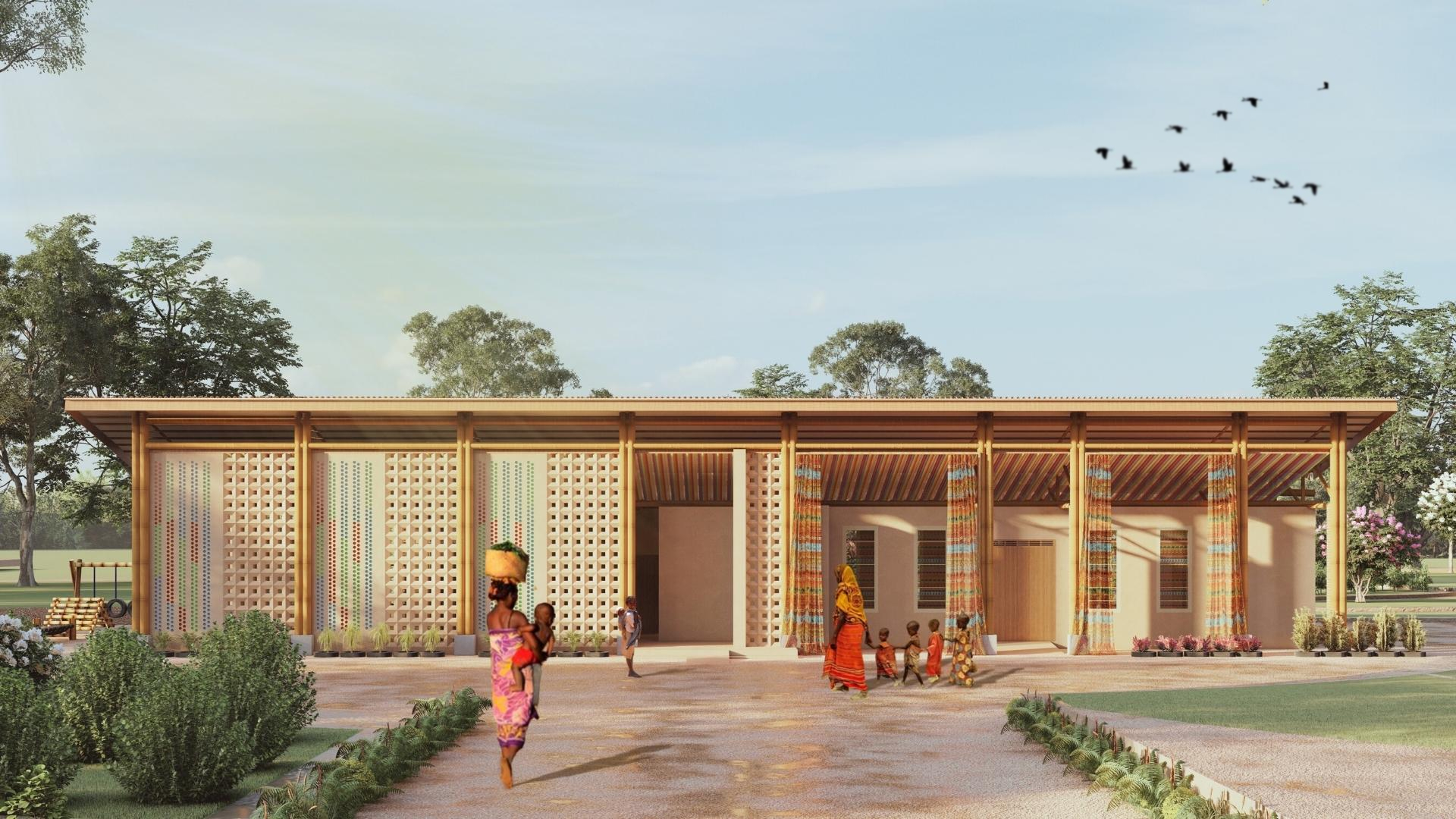
Design idea
When it comes to children, the idea immediately comes to a childhood game, namely 'La Marcelle. The game is based on 2 simple shapes, namely a circle and a square. This is where the concept idea started to help with the floor plan. The combination of squares and circles is very interesting and creates complex and dynamic spaces. Why do we use the concept of the children's game 'La marelle'? That's because we want this building to have a child-friendly nature, considering that the main function of this building is a clinic where children feel very uncomfortable when doing health checks. So we took the concept of this game and we changed it into a building design that has a game of shape and a game of color. And the next concept is the impluvium house. The design of this building is also inspired by the impluvium house which has a method to collect rainwater. So in this design, we have a rainwater harvesting concept that is used for the use of water in the toilet and also water for gardening.BULAYSTUR211717
Project by: Ayse Buldurur.from Turkey

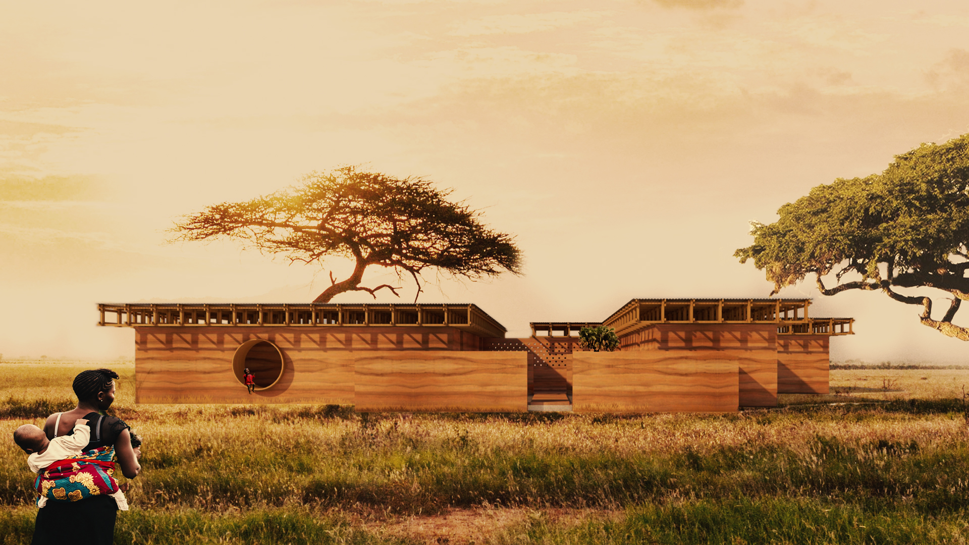
Design idea
To ensure that architecture goes beyond designing a building and starts to improve society is definitely one of the most important contributions that every architect would like to make. An African proverb says “It takes a village to raise a child”. Using this as inspiration this project intends to contribute to society by being one of the milestones to prevent child malnutrition by providing awareness, healthcare and organisations under one roof. The project area is located in village Baghere, in Sedhiou, Senegal which is on the other side of the bridge of Tanaff Valley, far from the administrative centre where most of the population is affected by poverty. Buildings in the neighbourhood are predominantly single storey dwellings, constructed of adobe, earth bricks, thatch and simple metal roofing, surrounded by bamboo fences or brick walls. The plot is located north of the river, characterised by a flat surface with red-sandy soil, mainly surrounded by mango and acacia trees on the east side of the main road. Children’s house is sculpted as a horizontal cluster of various simple rectangular modules, presenting its inviting façade to the main road and opening its front yard towards it. A protected area will be provided by erecting walls around the front yard for children. The aim is to offer a fragmented, modular series of spaces that is more appropriate for a child scale and will eliminate the feeling of being lost while creating a comforting feeling of home. The experience of this new home begins with the lush front yard, leading to the other functions such as a recreation room, reception and the main intersection at the centre of the house. The structure takes its cues from the materials in the village and is therefore integrated with the local environment and the surrounding properties. So the building, just like most of the structures in the environment, is as it appears to be, inside and outside laterite earth. A key feature of the programme was the implementation of common areas to encourage social encounters. This would enrich the soul of togetherness as children and their parents sit in the sunny breezy weather, sharing stories, playing games and regaining health. Water, provided from the rich Senegalese rains, is collected in a round pool, emphasising the collective character of the courtyard and providing a refreshing and playful element. Features such as this will provide a meeting place bringing people together from all functions such as administration, hospitality and recreation to ensure that a strong bond is developed throughout and experienced by all visitors. The ancillary spaces such as server rooms, changing rooms and storage are also abut onto the intersection. The connection of each main function with the outside is obtained by round windows, also used as furniture, which alters the rectangular character of the building. This adds a playful character to the property and reinterprets the traditional form of the building. The complex is sheltered under a wooden roof construction providing shade and protection while the intersection and front yard are open to the weather conditions creating an inviting environment for rest, relaxation and play.LIUBOCHI217685
Project by: Bo Liu, Wenbo Zhang, Junyi Wenfrom China

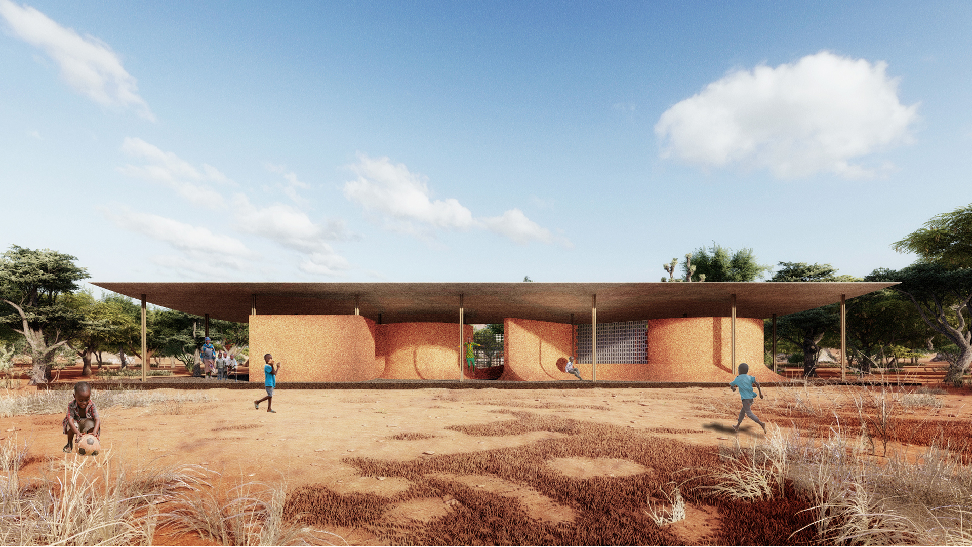
Design idea
In the design of this kid's home, our core consideration was how to create a space that is as clear and playful as possible with vernacular materials and a certain budget. Through a comprehensive analysis of Senegal's economy, culture and livelihoods, we came up with a few core design concepts: to create open spaces with sufficient shade with shadings, to use localized building materials and construction techniques, and to create interesting children's spaces through the geometric forms of spatial elements and interface variations. Based on this thinking, we start from the layout and try to combine the classical geometry, i.e. the combination of square and circle, through the typology study, to create a prototype of space with rich interface changes. Combined with the function, we then integrated the secondary forms to form a planar form full of flowing spatial senses. In the relationship between section and elevation, we fully consider the activity habits of children, and in the wall-base part, we complete the intersection of wall and ground through gradually curved joints to create an activity space where children can run around and jump freely. The shape of the roof continues the geometric language of the plan, using steel plates to create a small curved one-way roof, and at the same time, the roof is elevated to create a good ventilation environment. Through the use of classic geometry and local materials, a kid's center representing local style is created.MAGOLAEGY235518
Project by: Ola Maged, Mostafa Hazem.from Egypt

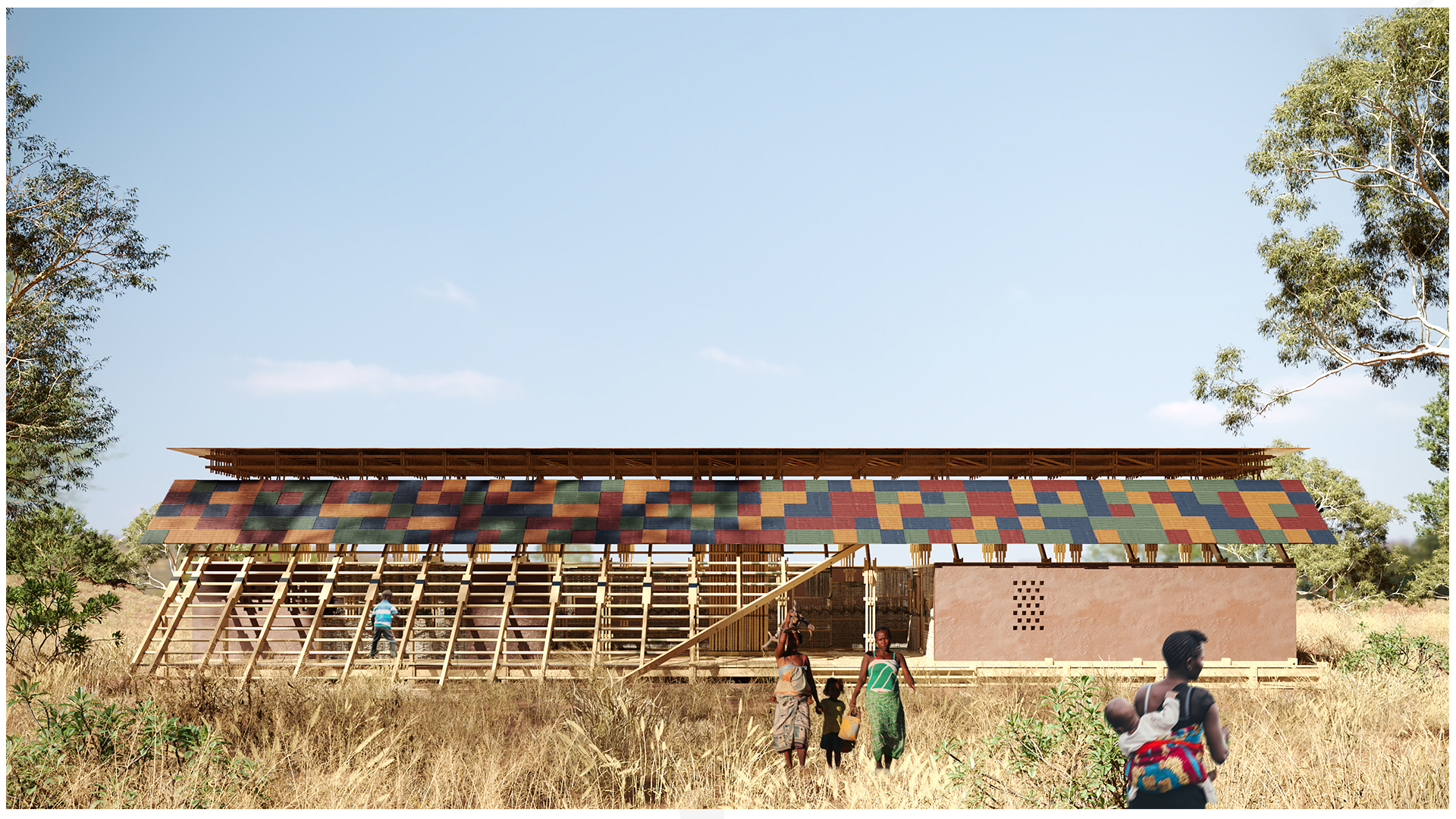
Design idea
According to the brief, ‘Children’s House’ should be warm and welcoming place where activities aimed at preventing child malnutrition take place. Although much of the burden of a child’s proper nutrition is placed on mothers today, children must be made aware at early ages on the importance of proper nutrition. Accordingly, the ‘children’s house’ is a space that must be designed primarily with the consideration of a child’s mindset. Rather than the space being a burden, where children go to, just because their mothers accompany them to it, the project aims to be more of a playful welcoming destination that children want to come to. To ensure sustainability of the project and raising awareness on malnutrition and correct nutritional practices, it is the children that the project should interact with the most. Accordingly, the project, ‘the toy-box’, is an assembly that plays on the children’s imagination and how they tend to see everything differently. Similar to a child’s toy-box, which stores a number of toys, the built structures assembles several spaces, with several activities. It plays on the child’s ability to intake knowledge through different mediums. Rather than having awareness seminars, lectures, or lessons, the project depends on a series of activities and games that help develop a healthy mindset towards proper nutrition. As a result, the project aims to be a child’s hotspot in a rural environment, where children come to meet, learn, and play. Accordingly, the project is composed of a set of interactive spaces that interconnect with the child.1- The Central Space: The central space consists of the storage area. It is surrounded by an open multi-functional area that acts as both a children play area and an activity area for classes and awareness activities. The space is highlighted by colourful gridded circles projected on the ground allowing the children to create various games and activities. Additionally, the gridded distribution allows for easy organization to allow the ‘children’s house’ staff to easily organise and monitor the children. The central storage space is cladded with bamboo allowing the children constant visual access, without any physical access, to the materials inside the storage.
2- Climbing Wall: The climbing wall is a sloped wall at the project’s entrance. It is used to induce physical activity where children can easily climb it. Additionally, it is a seating area children and parents can use while waiting. The structure also throws a gridded shadow on the adjacent recreational room to help create activities and organize the space.
3- Peak-a-Boo Walls: The peak-a-boo wall is featured on the interior walls of the Hospitality room, to help add a friendly face to the children being diagnosed and monitored inside. This will help ease the tension and relieve the children. The openings could be closed using rolling down curtains when privacy is needed.
4- Recreation Space: The recreation space includes a flexible space that opens to the outdoor area under the climbing wall. The gridded distribution achieved through the shadows of the climbing walls helps divide the space and create games like ‘Build up meals for the day’ where children group together and create day meals competing for the highest nutritional values. Additionally, some physical attributes like playful colours and perforated inner walls that add a constant sense of movement to the spaces, add to the playfulness of the project.
WUJIACHI190728
Project by: Jialin Wu, Hui Wang.from China

Design idea
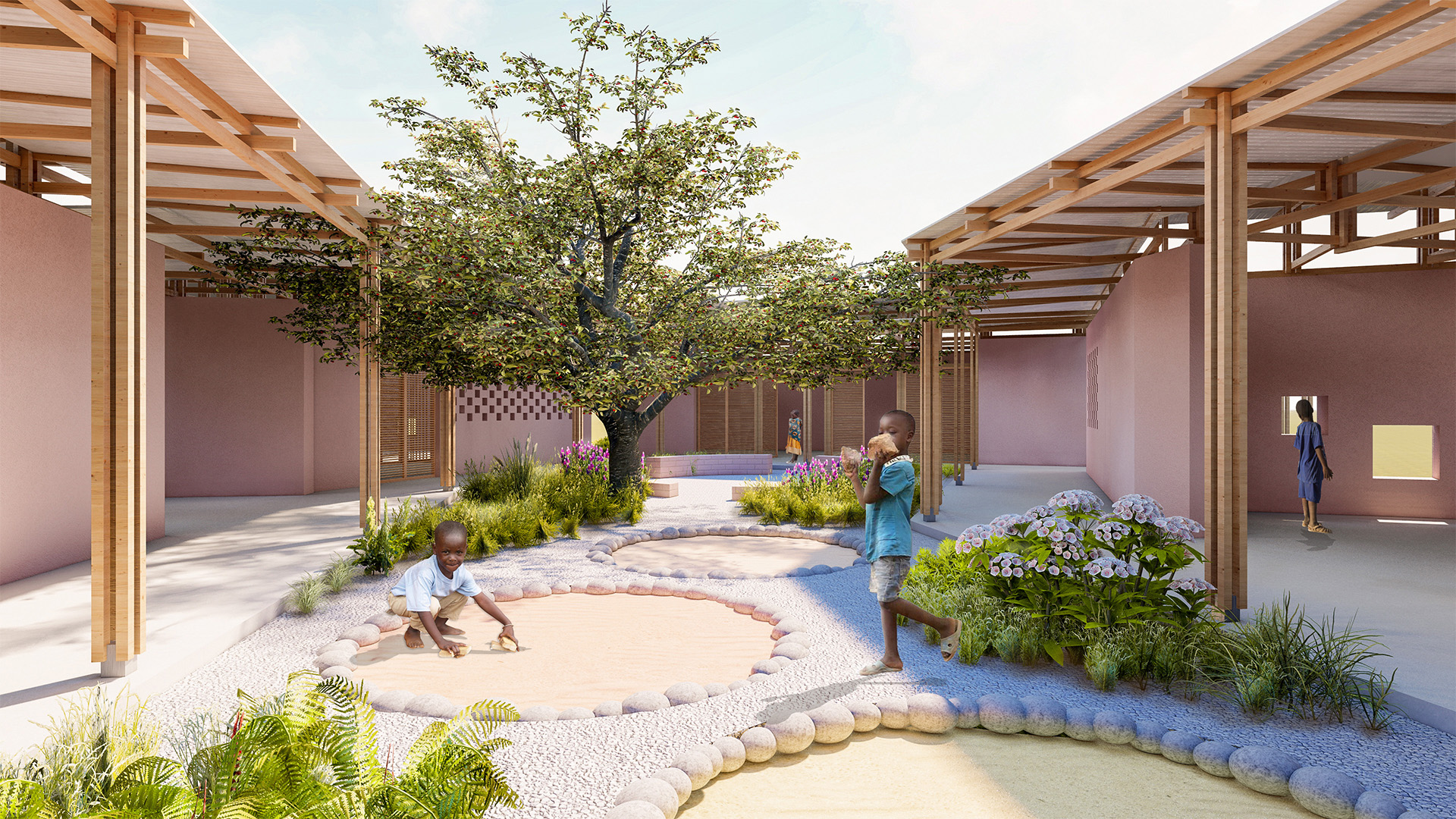
In this area surrounded by mango and acacia trees in southern Senegal, we wanted to create a sheltered and lively children's house that would provide medical service for local children and train community nurses to guide local families, helping children to grow healthily and raising awareness of health and hygiene in the community. The idea was to build a circular courtyard that would create a sense of protection and shelter, and at the same time provide with a peaceful, warm and homelike atmosphere, but the spaces are also very fluid and flexible in its use. Plants, sand and light meet in the courtyard, where children can interact with all that nature has to offer. The windows on the façade are staggered to suit the height of the children, allowing them to enjoy the view outside, and the way they are placed gives the façade a musical rhythm, making the children's home building itself dynamic. The house is built using traditional local materials and techniques. Local materials carry in themselves the identity of the place and the shared memories of the inhabitants, linking the architectural space to the site and create an emotional connection between the people and the place. In this lively and flexible space, children can explore, create and grow with the memories of the land.Top 50
BARDEBBRA254444 - ROMMARCHI117654 - TIBYOUMOR080222 - CAGOSMTUR150610 - RYMKARPOL020327 - KIMMINKOR221491 - ARMMIKIVO154444 - TIMTIMIND280804 - SCHLUKGER182047 - TURMUHTUR156106 - AHMARWAME170118 - GALLUCITA067910 - KEMDEEBUL226653 - DIEMARCOL182831 - HIUNGAHON282022 - HASAYAEGY302022 - ALVMANPOR282533 - SHAMENEGY236715 - LAMMANHON170000 - HUXIACHI291631 -BARDEBBRA254444
Project by: Débora Bardales, Stefanie Martins.from Brazil

Design idea
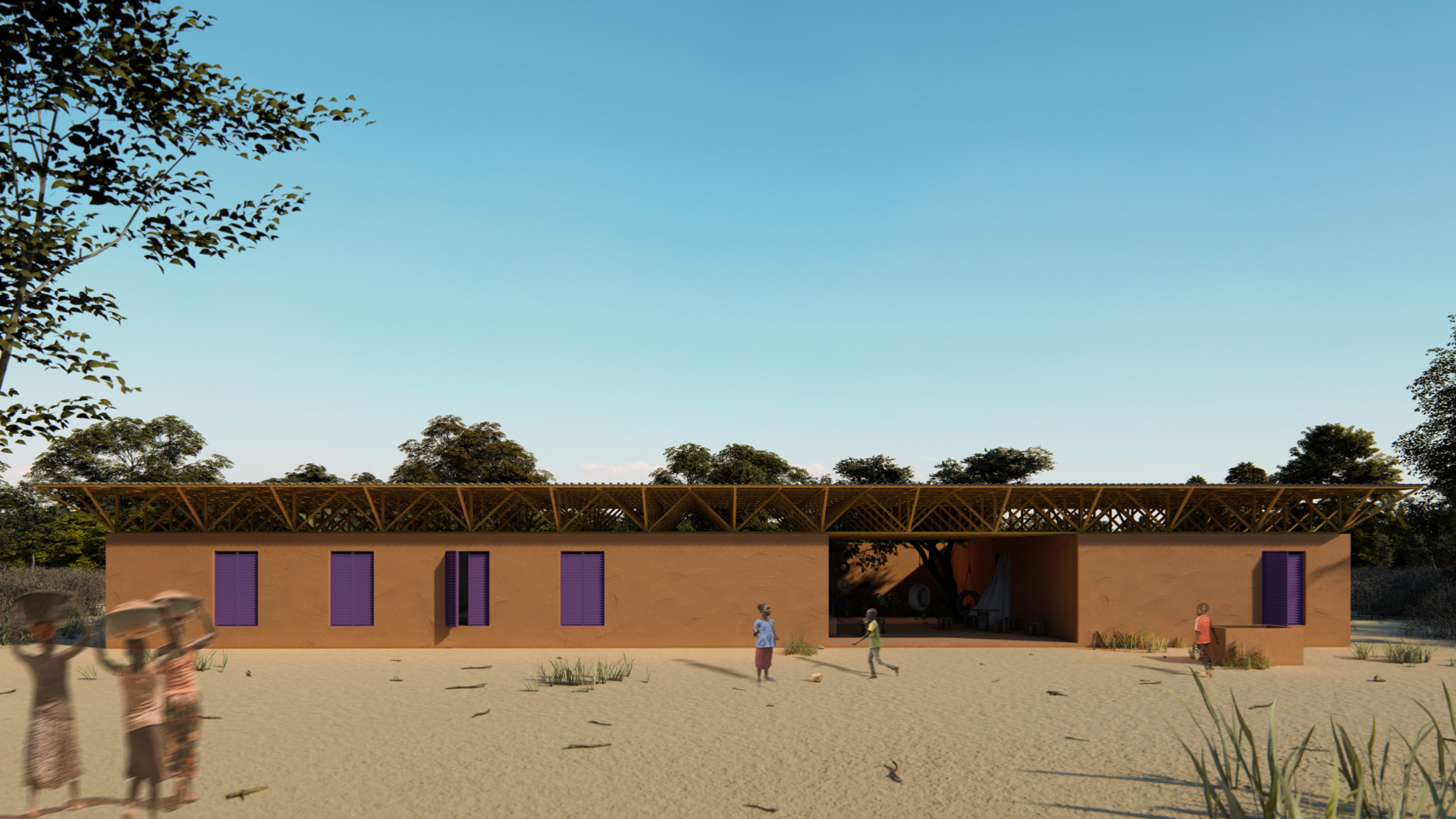
From the sensitive encounter between the potential of local culture and the surrounding nature, a space of shelter and awareness is born, materializing pure feelings: simplicity, joy and freedom. As the raw earth shapes the building, it creates a link with the sandy soil surrounded by mangroves, in contrast to a vibrant, fearless and color. The project aims to create different spatial dynamics with its free conception, modeling full and empty spaces from an alternative atmosphere to rigidity. Thinking about all times of the year, the water from the rains is reused in the well. When entering the children's house, it creates a welcoming void aimed at activities, allowing a connection with the outside, being an invitation to passersby. Based on this experience, functional spaces for services, management, bathroom and storage are proposed, represented by the flooded areas where the aim is to perpetuate the uncomplicated in the memory of the local inhabitants. The high coverage over the wooden structures and the uniformed openings in beaten earth allow the passage of time and sound in a natural way, creates a relationship with the human perspective.ROMMARCHI117654
Project by: Maria Trinidad Romero, Jennifer Araya, Isidora Sanche, Javiera Contreras, Camila Riquelme.from Chile

Design idea
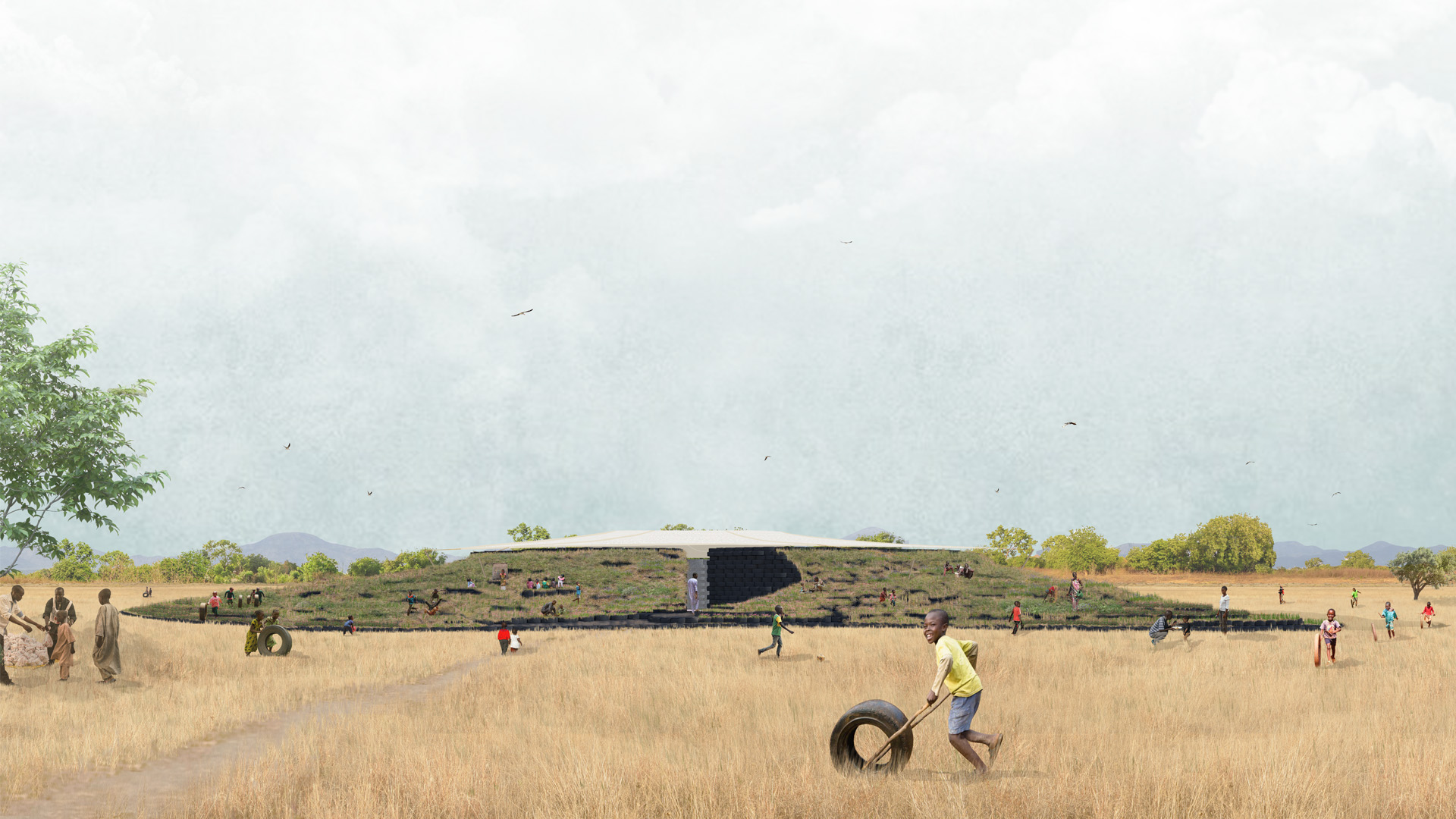
Spaces influence emotions and the children development is influenced by the environment around them, that is the main conception of the project. Through the upcycling of tires, we can provide new features to an element that has been discarded and its useful life has ended. Thus, we can contribute to child development through the creation of a building that delivers well-being to children and their environment too. The tire is used as a unit piece that creates a habitable space which is thought from its dimensions, and its exterior manages to originate a new landscape based on the multiple situations provided by the design of the topography. The tire-pography is aimed at children, and tires are elements that provide great opportunities in the creation of leisure and entertainment spaces, fulfilling the necessary characteristics to contribute to a creative, sustainable and educational design.TIBYOUMOR080222
Project by: Youssef tibourki, Reda Chraibi .from Moroc

Design idea
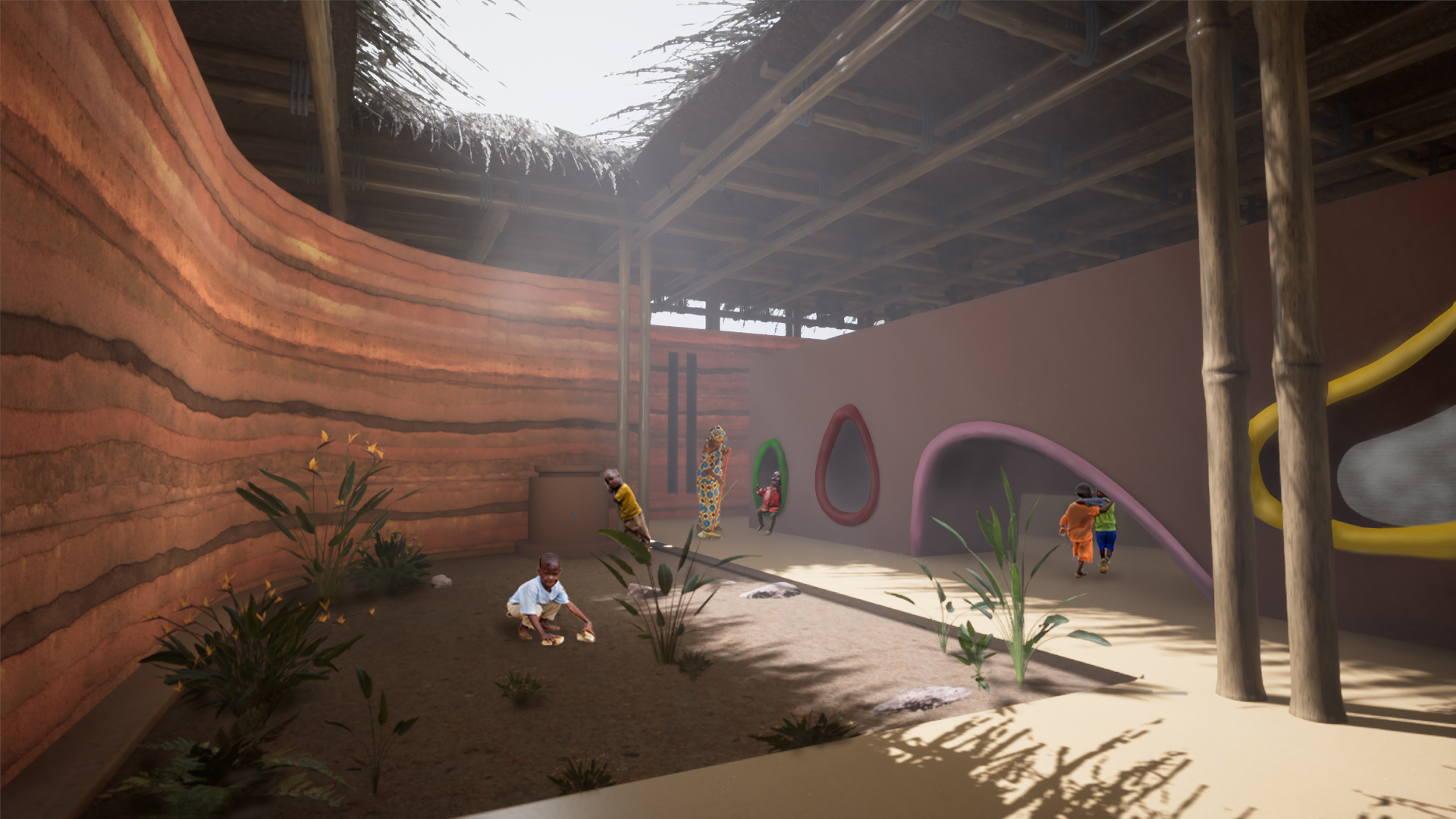
Children are the pillars that hold together our societies, and when they are in danger only solidarity can allow us to overcome the hardships they face. That is why our project puts the emphasis on collective spaces. A courtyard is hidden behind a curved earth wall. Soothing and reassuring, this wall welcomes us into a space of debate and exchange, where the taboo of being unable to feed one’s child can be lifted and solutions to a better feeding routine can be found. Children are the focal point of the project. The spaces for hospitality and those for debate are blended together by a long cob wall that is punctually perforated. It becomes a playful element at the center of the space that allows both constant monitoring of the children being treated and the extension of ludic spaces to the whole building. The children’s house, therefore, brings its main users to the foreground. They take up all the space being allowed to play everywhere while monitored and cared for. Our project puts the emphasis on playful activities and considers them an important component of the pyschological aspect of healing. “Water may also be good for the heart . . .” The little prince Water represents spiritual nourishment and the joy we can take in everyday moments. That is why our courtyard features a fountain that operates simultaneously at an adult and a child’s scale, bringing more peace to the inside of the curved earth wall that symbolically protects the users from outside hardships and brings them together to find solutions. The roof is a simple yet elegant solution. Mainly consisting of bamboo, rope and thatch, it symbolizes the strength of solidarity and how individual elements can stand strong in the face of difficulty. Its slender and highly horizontal appearance contrasts with the monolithic earth walls that make up the rest of the project. The roof unites and protects users of the Children’s house.CAGOSMTUR150610
Project by: Osman Çağine, Ertuğrul Akdemir , Süleyman Pişken.from Turkey

Design idea
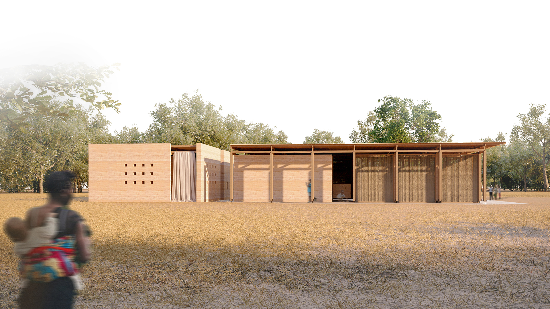
Nature reveals different coming together in every geography. These coming together form their own meaning and acquire a character. The coming together brought about by the struggle of children aged 0-5 with diseases caused by malnutrition, includes a healing process. Culture-nature duality helps to think of mother-child, child-society dualities and to create the spatial atmosphere of the moments of coming together. This duality, which extends from space relations to building materials, aims to describe the meaningful whole of coming together. While settling in the land, the area with a lot of trees to the east of the land was deemed suitable for children who had undergone a recovery process. In order to provide suitable climatic conditions and to determine private-public spaces, the recreation area was first defined. While creating a warm environment around a tree, the healing aura of nature was influential in this placement decision. Later, the gathering together of the spaces that make up the hospitality functions and the separation of mass and volume constitute the first design decisions taken. This attitude, taken in terms of controlling a healthy care/recovery process and due to the difference in day and night use, expresses the function of the building as a hospital to local people. At the same time, it determines the space around which other program elements will take shape. In this building, which describes the main entrance, there is the doctor's room first. There are toilets and a changing room followed by a 3-sided child care unit. Other necessary program elements gather under one roof and begin to take shape around these two focuses. The wooden column system that creates the roof structure is intended to allow more flexible space usage. This duality, which is preferred in materials, creates the most effective aspect in the expression of the structure. The circulation scheme has more flexibility and permeability compared to the hospital structure. Children's playground and management areas are positioned to integrate with the recreation area at any time. Despite the physical disintegration of the hospital structure, it has been closely associated with the children's playground so that the children receiving treatment never feel alone. On certain days, the children's playground turns into a stage or exhibition and aims to support children and their families who are receiving treatment. While the management area hosts meetings or seminars on certain days, it comes together with the recreation area outside of these days and offers different activities. The storage required for the hospital is designed to be located in the west, and controlled by the management area. The coming together of the masses here aims to create 2 inner streets inside and to bring the east-west cool wind into the building. The roof in the recreation area is kept open, and natural air conditioning is aimed. Along with all this, the project fulfills the necessity of presenting a healthy spatial atmosphere that will accompany children and their families in their struggle and recovery processes due to malnutrition.RYMKARPOL020327
Project by: Karolina Rymaszewska.from POland


Design idea
Today, 149 million children in the world suffer from growth retardation resulting from nutritional difficulties caused by poverty, conflicts, and the environmental crisis. An adequate diet, especially in the first 5 years of life, means facilitating the psychological and physical development necessary to develop all of the fundamental abilities to participate in social life.” Being conscious of the problem I understand how important it is for children and their lives to have a special place just for them. I have a vision of a sustainable house that is open and creates a space where children feel secure. Children’s House was designed on a plot located nearby the road leading to the village Diarifa. This place has a flat surface, mainly surrounded by mango and acacia trees. During the designing process, I aimed to create a building that supports and helps the local community with nutritional problems and is relatively easy to build. Therefore I focused on using local materials which high availability. Simple structure doesn’t require heavy building machines and most of the building site tasks are possible to do by ourselves. Another goal was to insert a local cultural element into the concept. Thanks to that building can have a unique local character. Most of the new building structures in Senegal have corrugated steel roofs and use baked in the sun clay bricks. I decided to use similar materials because of the understanding building process by local craftsmen. The fact that the local community is familiar with these materials helps in the building process. The children’s house is divided into a few separate smaller volumes with a courtyard in the center. The patio has a gathering, meeting, and play function. It connects all spaces. Thanks to that exterior blend with interior blurring borders. This element creates a hierarchy from public to half-public spaces, which brings graduation of privacy. It makes the possibility for interaction between users as well. Main access paths make a space porous and penetrate the whole building from each side. It helps in mixing structure with a surrounding. In the first volume, I located the administration function with a place to prepare meals. Space is multifunctional and ready to use in many ways. Public meetings, regular daily work, or workshops. In the second I placed storage, where will be a place for all important healing products. Supplements and other medical and nutritional materials. The next building is a recreational room for kids. Place for children where they can relax and have fun. It will contain tables with chairs, many games, and toys. The next two buildings are for hospitality functions. Bigger volumes can accommodate more kids at the same time, whereas small volumes are treated as isolation or examination rooms. The last building has toilets and a shower with changing room. The building uses local materials which makes it more integrated into the context. The form is minimalistic and follows function. A modular base grid gives a rhythm to constructing elements and organizes the space. In windows are special sunscreens made out of wood with unique local art. A simple and functional structure helps in an esthetical way fulfill the needs of the local community.KIMMINKOR221491
Project by: Min Ho Kim, Woo Seok, Geun Hong, Dong Kwan Hong, Seok Min Song.from South Korea

Design idea
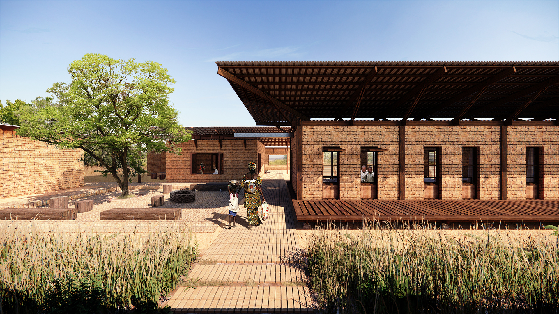
This village in southern Senegal is built with minimum natural materials like trees. Despite its vast tropical landscape and surrounding environment with trees, it absolutely lacks indoor space and private outdoor space for children. Private outdoor space in connection to the indoor space is for various actions and can create children’s creativity and more. We worked on creating integrated indoor and outdoor spaces for various activities. Changing the landscape through a series of works called architecture and presenting people with unique experience would be the right function of architecture and the social responsibility an architect should have. We would provide a comfortable place for medical personnel like nurses, contribute to education for village members, and provide mental and physical health for children through building Children’s House. 1. Arrangement plan We thought the program could be divided into two zones: Management Zone for education and support, and Treatment Zone for medical care, recovery, and lively outdoor activities. Buildings were separated by the program characteristics. A ventilation path was set between them to disperse and minimize their thermal energy. The roof extended to the outdoor space breaks the boundary between indoor and outdoor spaces and creates empty room with various heights. The site without slope is surrounded by trees, having the village road in the west and the forest in the east. We planned hospital facilities on the private east side and arranged offices, training rooms, and storage on the public west side for education and gatherings. Villagers enter from the west side, and their circulation would naturally be connected inwards. They could also enter the medical office. In addition, a long outdoor space with planted trees was set up inside and outside and at a place where the main access road intersected. This place is a buffer space connecting the two zones and provides pleasant space for villagers by adopting a natural ventilation system. 2. Natural ventilation system A wide and large roof was designed to create various spaces. Hopefully, children who need to be protected from the external environment could enjoy the outdoor space in a pleasant environment in rain or shine. Thus, they could move between buildings comfortably regardless of weather. Korean traditional space, Maru (floor), was set up to be off the ground. This allows putting some distance from the geothermal influence and good air ventilation by creating an air hole below the floor. While the wind that entered the empty place vented itself through the gap of the floor, children could feel cool, lying on it even in hot summer. The yard in the hot sun becomes hot during dry seasons, but as the outside air cooled by the shade created by plantings and eaves moves to the relatively hotter playground, children could enjoy the pleasant space. 3. Rainwater harvesting and purification system The roof with wide eaves has a slope toward the center of each building or unidirectionally. This type collects rainwater in one place during the rainy season. The collected rainwater flows into the outdoor courtyard through a sewer pipe. It flows to the harvesting place along the underlying filtration system. The water flowing in is safely collected by a purification system using a filter not needing machinery to provide children clean water. The use of materials found in the area makes construction easy, and there is no need to change the equipment regularly, so it can be used conveniently in the area. Additionally, ocher, rice husk, and burnt seashells are used for the surroundings of the well to provide children clean water.ARMMIKIVO154444
Project by: Armel Mikalo, Adriana Bidier, François Koudaya.from Ivory Coast

Design idea
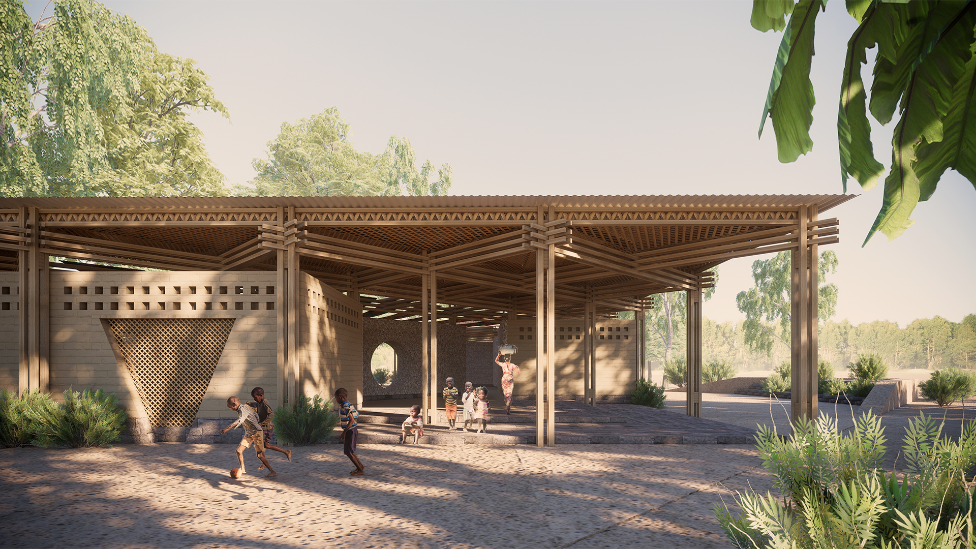
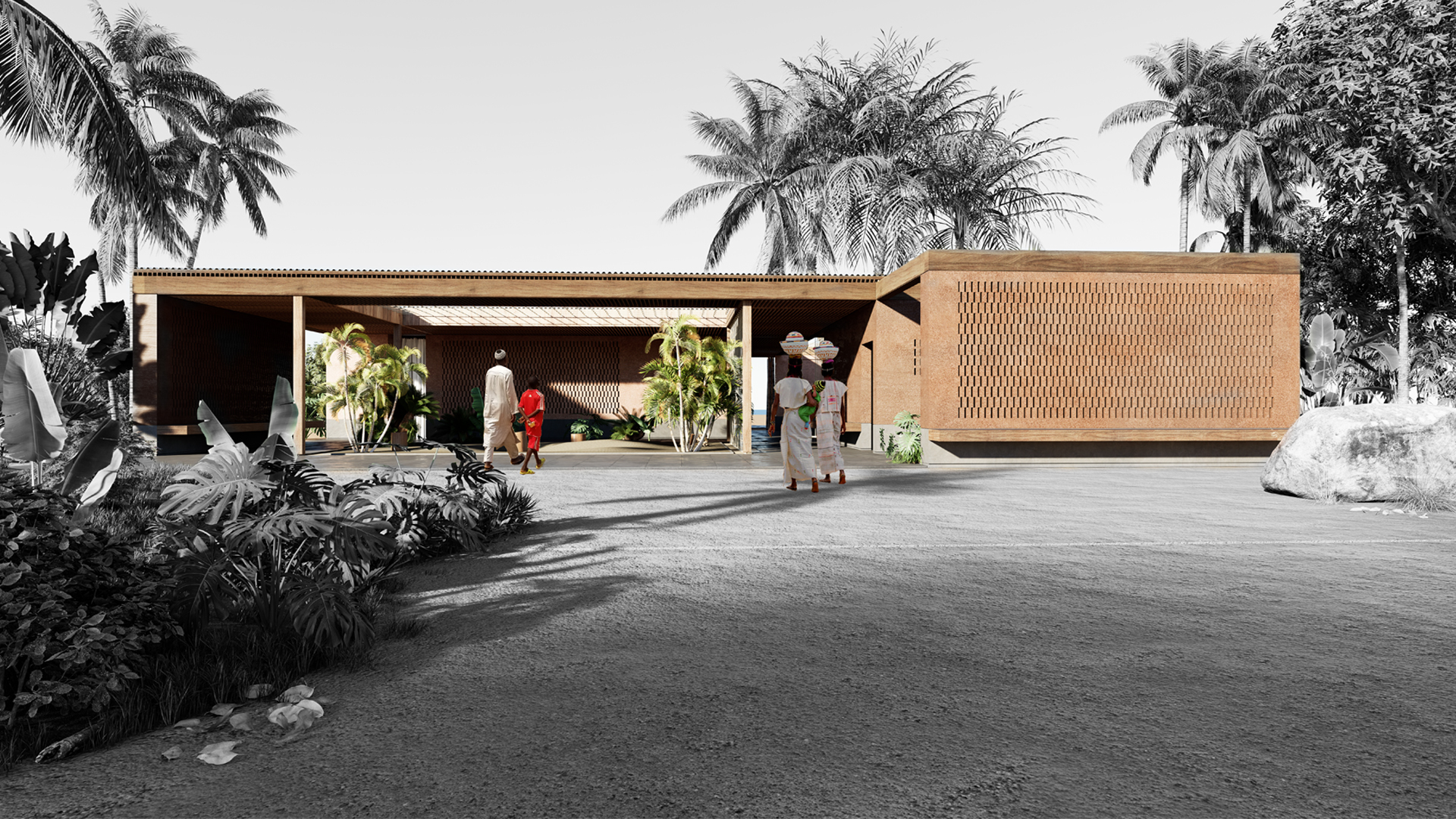
population dependent on local agriculture. That is why a children's home, in addition to being a place where activities to prevent child malnutrition can be carried out, is meant to be a sacred space to gather, listen, learn and share values. A symbol of hope, a physical manifestation of the commitment to end world hunger. Located in the village of Baghere, the Children's House appeals to a sense of community by organizing the main spaces on either side of a dividing axis that allows for easy navigation and provides outdoor social spaces interspersed with trees and gardens. A series of suspended beams, walls, and columns create a progressive sequence of neat immersive spaces that intentionally juxtapose moments of solitary engagement with moments of collective gathering. The house is composed of four non-linear but complementary and interconnected narrative paths. The first path, called the ‘’path of reflection about water » », starts in the external area up to the administration building and welcome those who come. A rainwater catchment fountain and drinking fountains are placed in order to invite visitors to freely drink water. Scenarios are created to reflect on the importance of water in everyday life and also on the need to protect it. The second path, called the immersion path in the garden, leads through a courtyard in a landscape that welcomes and invites children in a playful exploration of this recreational space. The architectural language of the structural elements, composed of wooden beams, is customized to create attractive play elements such as vertical nets, horizontal nets, swings, etc. Children can play, run and have fun. In the third path, a rectangular volume is designed as a Nest. A safe place to offer hospitality to facilitate the monitoring and care of at-risk patients. The volume provides a secluded space for women and children and separate facilities for assistants and monitors. Clay bricks are the main material. Small openings create a passive ventilation system that responds to the hot climatic conditions of the region. The interior temperature is thus regulated to provide a comfortable environment In the last path, the Roots Gallery is a designed space designated for both meetings and training activities. The goal is to promote education for a sustainable future. Here, the benches are scattered among rows of ropes made of natural fiber, which are strung on ropes over a narrow pool of water.TIMTIMIND280804
Project by: Timbul Tim, Joscelind Jo.from Indonesia

Design idea
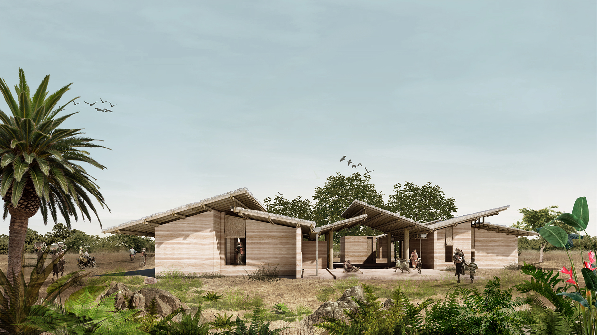
Focusing on the treatment of children's malnutrition we aim to provide space that is close to its surrounding nature with the attitude of respecting and celebrating the local well. A Place that allows the children to both be openly monitored and professionally treated at the same time, in the manner that everyone has the right to be served equally. To compose the articulated feature, we blend the formal space related to healthcare with the informal space where children and parents are able to socialize and mingle in a friendly place. Located in a tropical climate, the temperatures in Senegal's rural area are averagely high. Most of the land in Senegal's landscapes is dominated by savannah and a variety of low-consuming water trees. In the most tropical area much as in Baghere, settlements are featured with high slanted roofs with fewer openings, walls are made of porous material, and floors are normally formed by earth. On the particular given site, growing wild trees at the corner and intersection of the road, portray beautiful intimacy between nature and the local people, a natural intercourse that genuinely requires to be preserved and celebrated. By placing the facility facing the main road linear towards the existing trees we celebrate the advantage of a shaded land area likewise becoming an instinctive buffer for the building, guaranteeing the sun protection from the west to the east of the building. The elongated complex is dispart into multi-masses breaking down the solid monolithic structure, giving more room for the environment to conjoint, and creating more open areas. This as much lionizes the natural air to stream in and replace the saturated air through the gaps between each mass, we name it pocket corridors. These pocket-corridors then equip services features for the facility including sanitation and circulation. The multi-masses are humbly harmonizing with the savannah and the trees. The walls are made of thick forged blocks of domestic sand and clay, stacked one after another with the help of gravitation to create a steady structure for every single mass. The roofs are simply crafted from domestic production wood, at each meeting between blocks module made a gap as ventilation and also incorporated natural lighting into each space. Honesty and simplicity are celebrated through the exposed roof structure with locally made woven bamboo ceilings arranged on the roof frame. The final top-off is to wrap the building using straws. Whereas the in-between space becomes an open-outdoor hall connecting each building it further concurrently turns into a playground. The over-stacked roof is reaching to one another preserving the structure and bringing forth shelter and shading to the playground as well as water to the Rain Harvester. The sun shadow comes in projects exquisite irregular lines and shapes on the ground along with miscellaneous verdure and enrich the space experience all around from the start to the end of the complex. Right in the core of the open hall lies a gazebo featured with Rain Harvesting pond, creating complementary space to empower the collective process of parents and children in the pursuit of malnutrition assistance on the daily basis.SCHLUKGER182047
Project by: Schivelbein Lukas.from Germany

Design idea
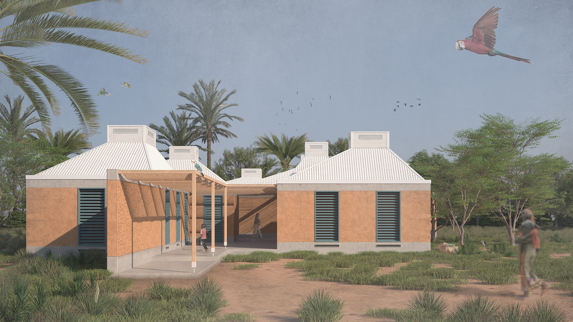
The design idea has emerged from the intensive analysis of the structures on site. Depending on the geographical location, buildings show analogies. For this reason, I decided to study these types in detail. Buildings near the equator must be able to buffer the high temperature fluctuations between day and night. To achieve this buffering effect, the mass of the buildings must be very high. That is why I mainly use clay and concrete as the main building materials. Another important inspiration for the design was the termite burrow. The termite burrow is perfectly thermally adapted to the environment. The corridors inside the termite burrow are naturally ventilated only by the shape and geometry of the corridors. I have tried to translate this principle into an architecture. The building consists of massive boxes that stand on a base to protect the boxes from moisture during the rainy season. The shape of the boxes is analogous to the typical houses in Senegal, but reinterpreted with new construction methods. The main entrances are accentuated by a wall panel and direct visitors directly into the building. There, one then goes directly to the treatment rooms and the multifunctional space. Within the building, the spaces between the boxes widen every now and then, creating an additional quality of stay. Towards the forest, the privacy increases. The centre of the building is the inner courtyard, around which the sleeping rooms and the playroom are located. The spaces in between are covered by mats of wild bamboo. The roofs have a "chimney" at the top, which ensures that cool air can flow into the building through the ventilation slits. This ensures thermal comfort. In addition, the roofs are shifted to the south to maximise the shading area of the roofs. The window openings provide sufficient light in the interior spaces. In the interiors, the organic shape of the ceiling is immediately noticeable. This consists of fabric stretched between ropes. The fabric fulfils two functions. On the one hand, it creates a very exiting interior, but at the same time, the fabric ensures that the radiant energy does not enter the interior directly, but is dissipated via the chimney. The Moringa tree is also an important part of the design. It grows well in Senegal and has many useful functions. One can eat many parts of the tree as nutrient-rich food. The tree also contains many essential vitamins and minerals. For this reason, it is ideal as a cheap source of food. The inhabitants should learn how and which parts of the tree can be utilised in order to be able to provide for themselves afterwards. Furthermore, the seeds of the Moringa tree have the property of purifying contaminated water. Thus, the collected rainwater can be treated before drinking.TURMUHTUR156106
Project by: MUHAMMET SAID TURK, FURKAN ENES AYDOGAN.from Turkey

Design idea
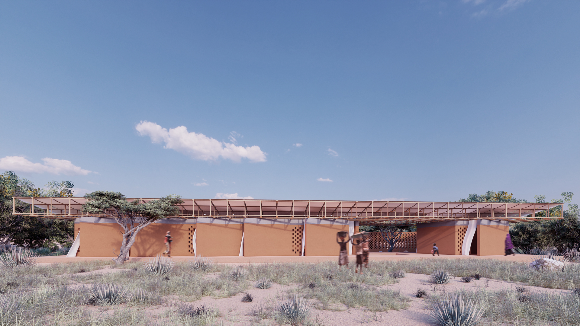
With the children's home, we have tried to create a "Home" that will host different functions, first for the children and then for the residents preserving the "place." The children's home aims to build on the healing role of the space. Healing requires mutualism of belonging and domesticity, along with references to the historical development of recovery. We can compare the belonging with the amount of transformation of the place by the users. We have centered our design on providing the transforming/will-to-be-transformed states of the place with the correct proportions of the tectonic units, with the flexible construction within themselves. The spatial transformation state created by flexibility enables different aspects of acquisition (ownership) each time and reveals the mission; What belongs to no one is what belongs to everyone. A façade extending to the tectonic line horizon and the plan is the entrance, where the encounters, the expected, the meetings, and activities are held, following the passive air conditioning, the circular units that do not miss the surroundings with their openings. We strived to make it a better place to relate to the observed nature with the unifying role of the roof, which protects it from water in rainy weather. On the other side of the entrance, the playground where the walls turn into a toy will serve various activities when necessary. It is valuable to us that trees, which are long-term guests of the place, are adjacent to the building on the settlement of the mass extending to the east and west. The roof, which incorporates water and light at the monolithic entrance and provides airflow with its layers, extended a comfortable and unifying space to its guests. The rear wall, which runs parallel to the building, provides open circulation and resembles a sheltering backyard with the continuation of the visual contact. We hope that the local architectural material, the soil, and the gaps in the structure, can become "a home" by referencing environmental architecture.AHMARWAME170118
Project by: Arwa Ahmed, Ogulshat Amanova.from States of America

Design idea
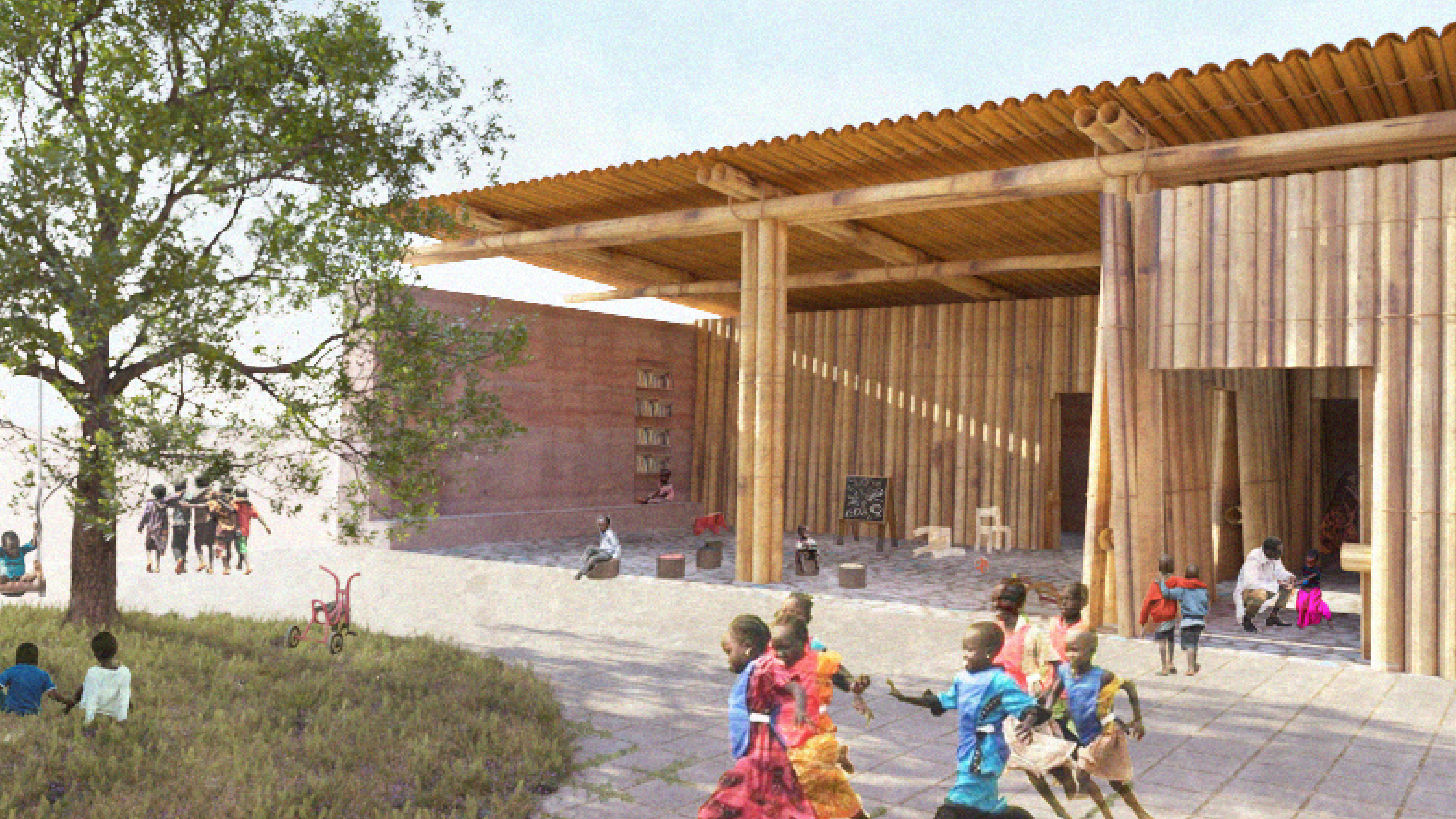
House is thoughtfully situated amongst the trees to incorporate the natural environment to aid in the process of healing. By addressing the mind, body, and soul, the architecture considers the importance of a holistic approach to overall wellness with the direct association of the environment. The Children’s House strives to reduce the anxiety of overwhelming doctor visits by providing a safe and joyful environment. The goal of the design is to remove any anxieties children may have regarding health facility visits. This is accomplished by creating a playful and welcoming atmosphere through elements such as a playground, invitinging outdoor spaces, large windows that bring nature inside, and interactive classrooms for indoor learning. Challenging the view and perspective of how health and wellness centers are portrayed, The Children’s House utilizes the many ways in which architecture sets the scene and shapes the atmosphere of a space. To heal the mind, the open classroom and outdoor small-scale farm, located at the North end of the building, aim to provide an interactive and engaging environment to host various activities that address nutrition and agriculture. The small-scale farm will serve as a classroom lab to emphasize the nutritional benefits of the seeds that are planted. To heal the body, the programmatic areas of sleep, health, and play are connected through their relationship with the immediate context. The sleeping and healing corridors are directly oriented to face the trees. The windows are designed to allow ample light in and allow the exterior space to spill through. The main courtyard that separates the two structures, bridges the facility and the outdoors; visitors interact with a harmonious outdoor space as they simply move from one structure to the next. By having constant engagement with nature and the outdoors, visitors are able to temporarily dissociate from their burdens and seek refuge in the beauty of the natural environment that surrounds them. To heal the soul, the meditation space located on the South end provides a quiet space to contemplate and pray. Within the meditation space is a water vessel for wudu, the ritual of washing before conducting prayer. This safe haven is tucked away from the joyful noise of the playground. Parents, visitors, and health professionals are encouraged to take a break and clear their mind.GALLUCITA067910
Project by: Luca Galleano, Martina Franco .from Italy

Design idea
The concept of the new children’s house is based on the analysis of the social, environmental, and economic matrix of the area, with the specific intent to give back to the community a building able to trigger social inclusion, contrast desertification and prompt new working skills in the community while fighting and addressing children malnutrition. To do this, and integrate the new building into the context, the project idea is to recall the aggregation morphology of the surrounding villages by creating 3 scattered volumes covered by a canopy where interstitial spaces are designed by mean of social aggregation and environmental empowerment. The external layout, volumes position and roof shape are designed to maximize comfort through natural ventilation and thermal radiance control. The major development axis is designed perpendicular to the prevalent wind direction to expose the maximum amount of surface to wind collection. The shape of the roof prompts the stack effects thanks to inclined planes while decreasing thermal heat transfer from its surface by maximizing self-shading, and from the surrounding ground by extending its shadow all around the area. The external space under the canopy is designed as a mixed space for social and environmental empowerment: in the northern part the elevated basement hosts a covered agorà thought to be a playing space for children, while it can be also used, during non working hours, as a gathering space for the community. In the southern part a second plaza is created around a pool for rainwater harvesting in the rainy season with an educational garden to teach sustainable agricultural technique to help fighting malnutrition and deforestation. The perimeter of the basement is also characterized by holed walls – obtained by tilting the raw earth blocks of 45° – that have the scope to let the wind in, while decreasing the discomfort due to gusts of wind, and create eco-pond for vegetation to fight desertification, thanks to their folded shape. Furthermore, the central area is characterized by a connective space that could be use as space for children to play but also to spread information and assistance. Around this area are located the 3 main volumes of the building, divided according to their own function. The first one hosts the administration activities and a deposit. It is also the place where to receive peolple while entering the new children’s house and give them the first assistance and guidance. In the second volume is located the recreational area, the heart of the whole structure, highlighted by a chimney that extract exhausted air from the inside: it is meant to become the landmark of the new building. This space is built around the pedagogic idea of a learning and discoverable environment: kids can learn and discover the world thanks to different space assets and a protect inner garden. The last volume is more secluded to allow for more privacy because of its function: here the medical visits are conducted, and people could be hosted to be monitored. All these spaces are characterized by a natural ventilated cooling floor: a floating floor is fixed on tires that create a ventilated subfloor where the air, collected from the outside through concrete brick tunnels, is cooled down by the lower ground temperature, and it’s extracted through the linear holes between the floor planks thanks to the stack effect.KEMDEEBUL226653
Project by: Deepak Kemchand, Vyara Veselinova, Monika Angelova .from Bulgaria

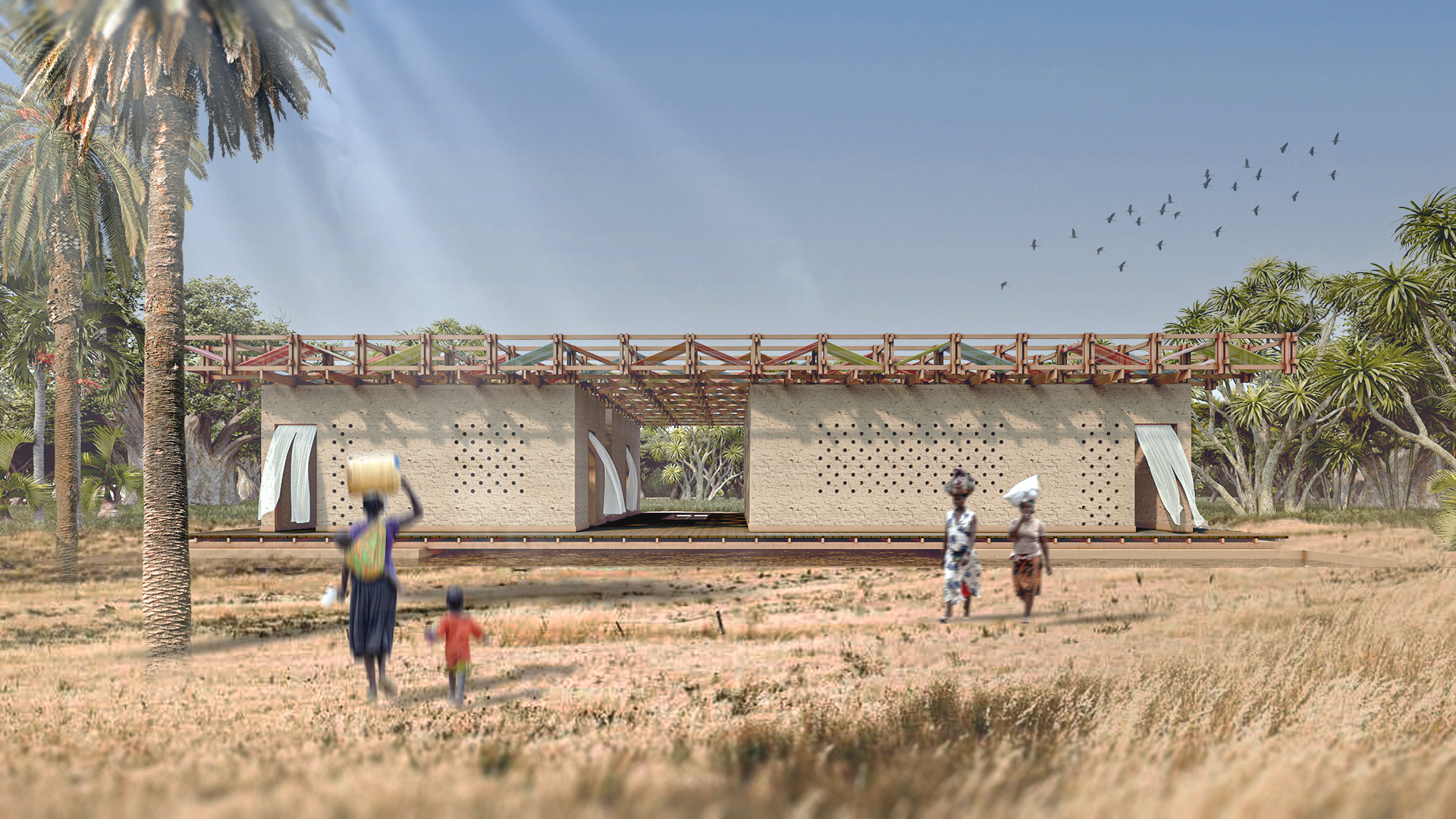
Design idea
“My mom woke me up earlier today. She said that we are going to a special place, called “Children’s house” . I dressed up and we started walking. After a while I saw a building with many colors on the top. The House had two simple forms, different by sizes, with one common roof. I recognised three colors among the wood of the roof, but the sun was shinig so beautiful on the fabrics, that in the first moment, they looked like a thousand. When I looked down I saw the reflections of the colors in a water pool in front ot the building. I ran to the pool to touch them and when I bent down I saw that there was water under the building too. How strange was that? A woman was standing on the entrance and smiled when she saw me. We entered the building, passing on a little bamboo bridge, and followed her to a small room, with two beds. I asked the woman why there was water beneath the building ? “The water aims to cool down the building” - she told me - “When the days are hot, the African sun heats up the water pool. The steams from the water are going beneath the building’s construction and cools the House from the basics”. “Do you want to know about this little openings that you see in the walls?” – I confirm with my head. “Did you notice that from our side they are twice as smaller compared to the outside? Make a fist with your hand, but leave a little hole. Now - if you exhale in your fist you can feel the hot air running through. Try that again, but make the hole bigger at the end. Do you feel the air a bit colder? The same principal is used for the openings in the walls.” - A page from Idir’s diary.DIEMARCOL182831
Project by: MARIA PAULINA DIEZ, DAVID ARANGO .from Colombia

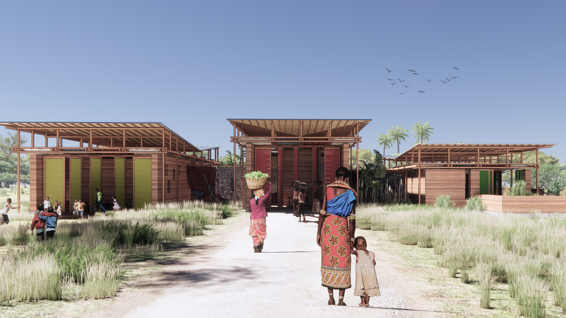
Design idea
Located in the Tanaff Valley, in the village of Baghere, in front of a road and situated on flat, clayey land, with acacias and mangoes, a space is planned where malnourished children can arrive and be treated, there is where the idea of La Casa de Los Niños was born. Made of three volumes united through a longitudinal circulation, where their activities complement each other in relation to nature and the outside through openings and shuttered doors that frame the immediate environment. The program is defined according to the requirements and uses of the spaces, where through an access hall they are divided into served spaces on the right, directed to the care of children and on the left the servers, which complement their development. Its roof is conceived through an independent structural system, where the wooden structure of the roof and the rammed earth walls seek to optimize existing resources and generate wide spaces for comfortable use. The experiences are generated as the different spaces are traversed and the vibrant sun plays to glimpse through the different openings, the heat is filtered through the different layers of the roof that help to reduce the temperature and a constant flow of air is flowing through the project.HIUNGAHON282022
Project by: Hiu Fung Ngai, Hak Long Ng, Pui Yin Tang, Lee Ching Tung Cheryl.from Hong Kong

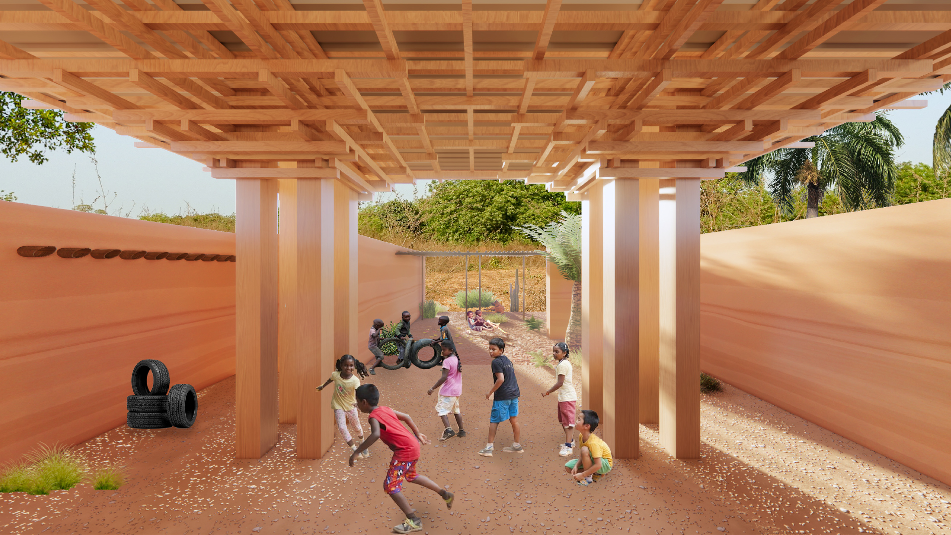
Design idea
On the flat grounds of Baghere, along the N6 national route in Tanaff Valley, sits a linear strip of red earth, bamboo and rosewood that is the Children’s House. With its accessible location, it welcomes the young from not only Baghere, but also neighboring villages such as Diarifa and Bakidioto, serving as a warm, nurturing and educational place that fights against malnutrition in children. The journey through this piece of architecture starts from an inviting gesture on the east side. Walls of red earth extend outwards like helping hands, guiding you as you enter and submerge yourself in the shadow cast by the floating roof. The entrance is marked by the two columns and the archway in between, which is created by the roof structure. Playing with semi-open space, the ambiguity of the threshold emphasizes the welcoming nature of the Children’s House. The interior spatial order is determined by an array of rosewood columns, each of which comprise four thin trunks. The columns grow upwards into an intricate structural support system that formulates the unique architectural language of this building. The delicate roof structure not only allows the roof to appear to float lightly, but also creates archways overhead, defining the spatial hierarchy within the Children’s House. In the semi-open administration area, the roof structure, not unlike Roman vaults, adds grandness to the communal space it shelters. Free standing bamboo screens are used to divide the space, allowing it to be adaptable and user-driven, while also encouraging social participation. Further west lies a corridor which leads to the examination room and eight en-suite dormitory rooms. Natural light seeps softly into the corridor through the gap between the north wall and the half-arch roof structure, giving the transitional space a calm atmosphere. The walls of the rooms are defined by and integrated with the columns, minimizing the interruption of space. Each room extends to the south and opens up to a “private courtyard” exposed to the elements, where sunlight enters the room like rays of hope. Beyond the secret garden stands the flexible south wall, consisting of bamboo screens that can be easily opened up and transformed into a shading device by the user. With the play of light, the use of flexible systems, and the introduction of landscape to the interior, the building boundary is blurred. It is only with its integration with the landscape and site that the Children’s House can truly welcome and be welcomed.HASAYAEGY302022
Project by: AYA HASSAN, HIBA MOHAMED, MARYAM HASSAN, ABDELRAHMAN HASSAN, SAMAA ELZAWAWY .from Egypt

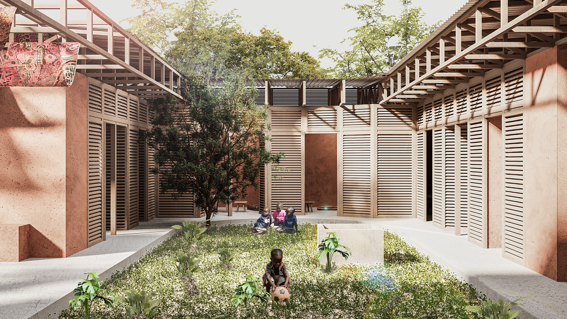
Design idea
In a place dominated by simple rural life, where architecture is closer to the land and simple dwellings that arose from the origin of nature, a house for children is born, a house of hope and life, and in the middle of it there is the beating green heart, a courtyard that achieves the idea of self-sufficiency, where agriculture is carried out to produce food crops. Where children and their mothers participate in agriculture to eliminate the problem they face along with other aids, and the establishment of dialogue with nature is not only achieved through the yard, but there is a free void overlooking the green nature of Baghere and interspersed with the distinctive fabrics of Senegal as an expression of identity and that Bagere's identity is linked to its relationship with nature and that Crisis therapy comes from the heart of Baghere's nature, a place that brings together children and mothers and strengthens communication between them. The organic lines form an orientation inward and an interactive dynamic range that emphasizes that the Children's Home is a warm and welcoming place. The spaces are designed in a flexible and open way, which increases the dynamism of the spaces and provides the opportunity to integrate the interior spaces with the exterior nature, and allows the spaces to be expanded and adapted to different activities. Integrating light, green spaces and water through the design of the square fountain are the common elements in African homes to emphasize the containment and warmth found in their homes. The light infiltrates through openings in the ceiling to allow in the gentle rays of the sun to instill a sense of hope and optimism in children. The roof tendencies help in collecting rain and directing it to irrigate the yard and the green heart of the project.ALVMANPOR282533
Project by: Manuel Alves de Campos.from Portugal

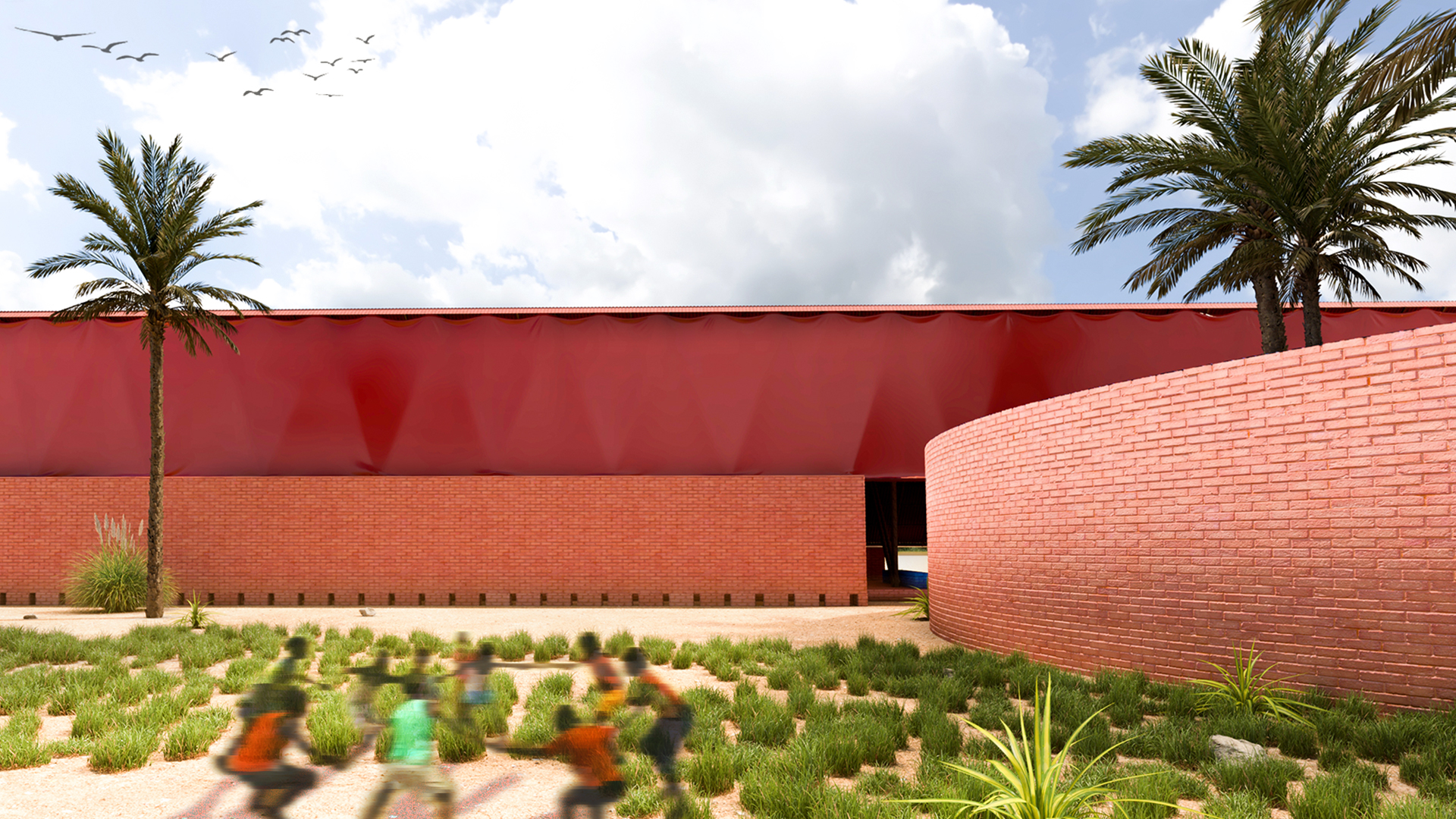
Design idea
spaces. Protected spaces, from extreme sun and heat, from seasonal rain - are passively cooled, with constant airflow and adequate shade, are made possible by detaching the roof from the partition walls. This detachment allows autonomy of the two structures and favors the adequate natural air conditioning of the interior spaces, where the flows of fresh air clean the hot air that accumulates higher up. The long sloping roof collects water from heavy, seasonal rainfall that is then transported to storage tanks. The interior spaces follow a sequential distribution. Starting with a consulting room where children and mothers are examined. This is followed by the administration space, the storage room, the bathroom/ dressing rooms, and the dormitories. The spaces where these activities are developed are delimited and protected by walls, seeking a sense of interiority, so that the activities are developed with privacy and autonomy. Each of these spaces has its own patio with vegetation, helping a controlled relationship with the outside. The flexible spaces, allow the people who live and work in this house to appropriate them in many ways. Nearly 40% of the house is left without partition walls creating a free space, for a variety of activities with the children to take place. The circular patio will itself be a flexible structure, it can be used as a vegetable garden at a certain moment, it can be covered with a tarp and serve as an auditorium, or just a delimited space where children can play safely, always with the idea that the circle gathers people around it.SHAMENEGY236715
Project by: Mentalla Shaaba, Nariman Mostafa, Nadeen Hesham, Yahya Hosam, Yahiaa Mohamed .from Egypt

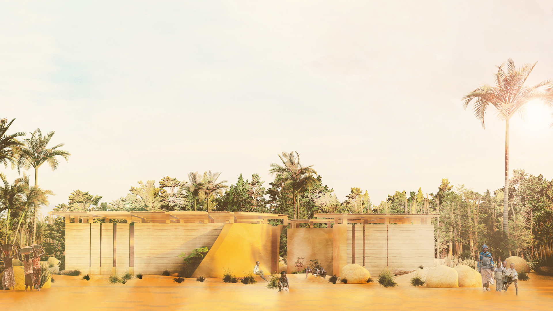
Design idea
Does the Flap of a Butterfly's Wings in Senegal set off a Tornado in the world? Our butterfly started flapping its wings in the children’s zone, causing a tornado of awareness all over Africa. The butterfly effect describes how a small change in one form in a nonlinear system can cause a huge difference overall. It will untie the knot of many withhold cases such as sustainable development goals. Solving the chaotic situation of malnutrition with small steps could eventually lead to a huge impact, expressing the idea of the butterfly effect. Observing one of the core problems in Senegal, malnutrition, we found that hidden hunger is the most concerning due to its hidden symptoms: lacking vitamins and minerals. Hidden hunger is the most affecting type of malnutrition that touch 340 million children globally. Therefore, children’s growth, immune system, and cognitive abilities get malfunctioned in an unpredictable manner. In our project the child is characterized by having random movements and high curiosity to explore. On a similar note, we compared the unpredictable physical features of a mal-nutrient body with the life behavior in Senegal, through the main sources of nutrition, land and traditions. Studying soil thoroughly, it is found that Senegal is facing strong degradation, that happens without the knowledge or seeing of the human being in a short span of time. It causes gullying and removes the surface layer. Moreover, we observed that the Senegalese food and traditions has a famous food: Albino Senegal Bichir fish. Studying the fish, it is observed that is has several unpredictable traits and actions: living in water and in land according to the availability of nutrition. From the above anecdotes, we got inspired from the uncertain properties of each the fish, soil degradation, and the sudden symptoms in humans resulting from hidden hunger and how an unrecognized element can hugely affect a larger case. Translating into Architecture, the starting spreading point is the catalyst from recreational zone that withholds energetic children, created to target Senegalese children. This courtyard acts as a force that deformed the motionless box into three different masses, being static from the outside yet dynamic in the inside, holding different functions. This flexible interactive courtyard has no sharp lines and is smooth to act as a starting point. The three masses are further divided according to its function. One containing the medical aspect of the project with its central storage. Another mass holding administration, and a third mass consisting of the awareness and training where parents can learn more about malnutrition. The main focus was on giving the user, specifically kids, unpredictability starting from the approach. In a macro scale, the user predicts the project to be static; however, when moving to a micro scale, approaching the entrance, the user starts to be surprised by the more dynamic, and playful zone with the use of clay that melts into the exterior walls of rammed earth to emphasize the entrance. The medical center mass is extruded to emphasize its importance. Therefore, the user’s subconscious prepares for physical aspect adjustments. This project will untie the knot of sustainability and malnutrition to act as a starting point of a worldwide impact globally.LAMMANHON170000
Project by: Man Yan Lam, Wai Lam To.from Hong Kong

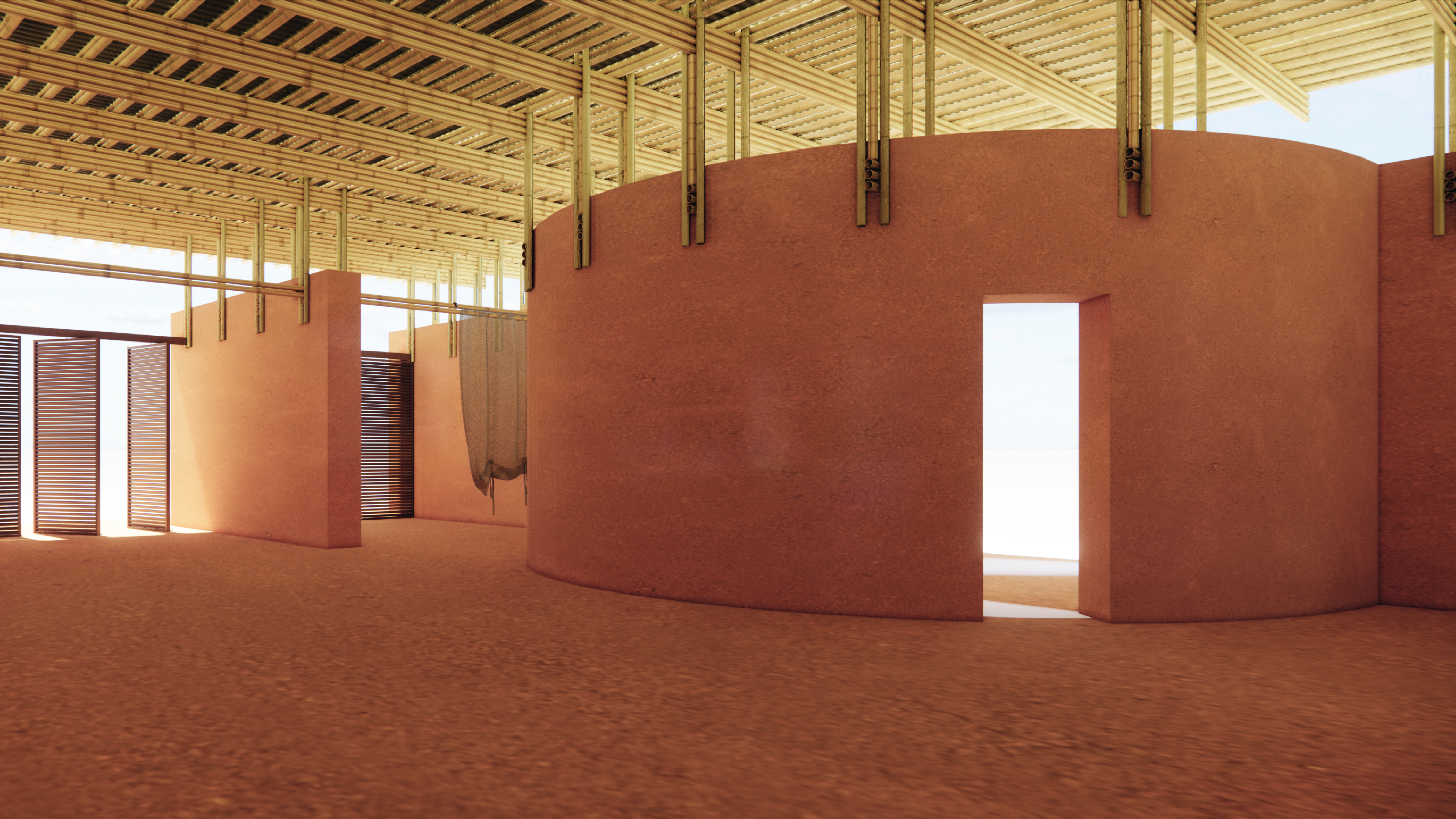
Design idea
The Children’s House is a place patients come for healthcare appointments, nurses come for training, villagers come for different talks and activities, and most importantly, children come to play while they are being monitored or taking treatments. It is also a role model of architecture adopting locally sourced materials, local human resources, at the end helping the locals in a circular ecosystem, while concrete the modern material is slowly invading in Senegal where the village of project site is in. The design continues local building traditions, and together with the Women’s House lies in the same village, it is intended to act as an example of modern earthen architecture in Baghére, Senegal. Not only as a functional space, the Children’s House is also a welcoming place for children. The design concept arises from such vision. The grid is stiff and regular yet the rigidity is broken by insertion of several dynamic circular spaces. On top of the grid highlighted by five thick cob walls on the orientation of SE-NW, there inserted four circular spaces, two as relatively more private function (administration office, bathrooms) and two as covered open space which could become community space for the villagers, each sitting on one of the four elevations. Caves carved out of the massive front wall near the entrance provide hiding places where children can play or read or enter the House in a playful way, softening the image of the House as a clinic or medical place. The Children’s House belongs not only to children nor adults, it belongs to the community of Baghére. Therefore, two semicircular spaces on the long elevations setting the main entries into the House has no door, welcoming everyone at any time, and integrating the relationship between outdoor and indoor space. The House is constructed of thick cob walls, which support a lightweight bamboo framework that in turn supports the corrugated metal roof. Walls are made in adequate thickness so as to allow addition of straw to the mixture to offer more stability of structure; roofline is also extended beyond the walls to prevent them from being damaged by the heavy rains of the monsoon season; bamboo roofing structure offers protection from the sun while still lending a light and airy feeling to the interiors, so that the rooms are cooled by cross-ventilation. In overall, the Children’s House is intended to create a modern architecture by adopting traditional materials (cob and bamboo) that have long been existing in the village of Baghére; designed with simple details that unskilled locals could also participate in making the House; to be constructed in low-cost and energy-saving alternative to concrete structures.HUXIACHI291631
Project by: Xiaoqiong Hu, Lijun Wu, Can Yang .from China

